Benjamin Moore Santorini Blue 1634 Review: Undertones, LRV and Coordinating Colors
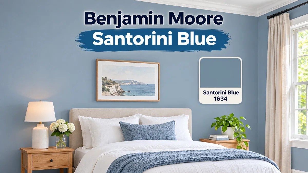
Benjamin Moore Santorini Blue 1634 is a cool, mid-tone blue with a touch of gray. Its official light reflectance value is 44.67, so it sits near the middle of the scale: soft and calm rather than pale or dark. It works best in rooms with decent light, crisp white or soft neutral trim and natural wood, and it needs a sample swatch tested on your own wall first. It suits homeowners choosing a calm blue for walls, kitchen cabinets or a bedroom, and it works less well for anyone who wants a bold or warm color.
Competing reviews disagree on its code, LRV, hex value and undertones. This Santorini Blue paint color review treats the official Benjamin Moore pages as the source of truth and flags every conflict, so you can see which claims are verified and which are opinion.
What Color Is Benjamin Moore Santorini Blue? A Quick Answer
| Spec | Official Benjamin Moore value |
|---|---|
| Name and code | Santorini Blue 1634 |
| Collection | Benjamin Moore Classics Color Collection, also called the Classic Collection |
| LRV | 44.67 |
| Hex | A2B4BA |
| Family | Blue, subfamily Blue Gray, medium value |
| Description | A refreshing, cool, sophisticated blue with a touch of gray |
| Coordinating colors | Cloud White 967, White Sand 964, Distant Gray OC-68, Wolf Gray 2127-40 |
| Similar colors | Beneath the Clouds 2131-50, Slate Blue 1648, Cape Blue 1642, Colorado Gray 2136-50 |
The official page does not list trim colors, finishes for this color or room recommendations beyond an Office project tag. Those points below come from competing guides and are labeled.
Is Santorini Blue Warm or Cool?
Santorini Blue is a cool blue. The official description calls it as refreshing as it is cool, with a touch of gray that keeps it from feeling icy. In practice it reads as a muted dusty blue, a mid-tone blue rather than a pastel or a navy. One competing guide calls it a refined cool tone with a serene coastal feel, which makes it a natural coastal blue for homes that want calm without bright color. Another guide says its undertones sit between warm and cool, which does not match the official cool description.
What Are the Undertones of Benjamin Moore Santorini Blue?
Santorini Blue undertones are officially gray: the only undertone the official page names is gray, and its subfamily is Blue Gray. Competing guides disagree:
- One guide describes a hint of gray, and another a blue with a touch of gray, both matching the official page.
- One guide describes gentle green undertones. The official page does not mention green, so treat it as an opinion that may show in some light.
- One guide lists lilac, light purple, mint, pale yellow and turquoise undertones. That list does not match the official page, so it is not presented as fact.
- One guide calls the color HC-151. The official code is 1634, so the official value stands.
Gray undertones are the verified answer. A paint sample swatch will show whether your room pulls it toward green or purple.
What Is the Masstone of Santorini Blue?
Masstone is the color as it looks straight from the can, before light and surroundings change it. The official page does not use the term, but it lists the hex A2B4BA, a gray-leaning blue, as its digital reference. One guide gives 80D5D5 as the masstone, a much brighter aqua, and another gives A7B9BE, and neither matches the official page. Benjamin Moore also warns that screen colors may differ from real paint, so use the hex as a guide and trust a physical sample.
What Is the LRV of Benjamin Moore Santorini Blue?
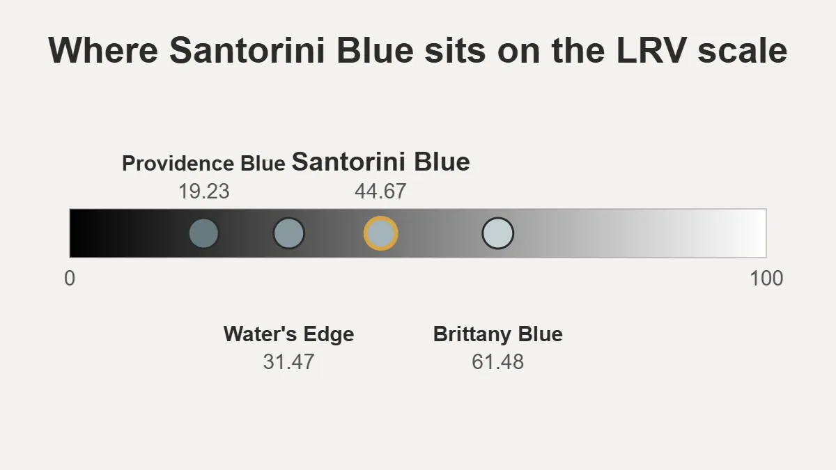
The official Santorini Blue LRV is 44.67, shown on both the US and Canadian pages. LRV, short for light reflectance value, runs from 0 for black to 100 for white, so 44.67 means the color reflects a little under half the light that hits it. Two competing guides give the same number, while another gives 48, which conflicts with the official page. The UK page does not list an LRV. For scale, the same official pages list Brittany Blue 1633 at 61.48 and Providence Blue 1636 at 19.23, so Santorini Blue sits closer to the middle than to either end.
How Does Lighting Affect Benjamin Moore Santorini Blue?
Santorini Blue lighting has no official data, and competing guides contradict each other:
- North-facing rooms: Two guides say the color looks darker, flatter or more muted in cool, low north light.
- South, east and west light: One guide says south light makes it livelier, east light fresh in the morning and softer later, and west light cozier.
- LED lighting: One guide says LED bulbs make it look more gray, while another says cool LEDs look sharper and warm LEDs more comforting.
- Incandescent bulbs: One guide says they make it look bluer, another says they add warmth, and a third says yellow-toned bulbs can make it muddy and gray.
Because the guides disagree, test a large swatch in your room and check it in morning, afternoon and evening light. Benjamin Moore notes that screen colors may differ from real paint and offers free color chips at local stores.
Using Benjamin Moore Santorini Blue in Real Homes
The official page tags this color for an Office project, and the Aura interior paint page lists bedrooms, kitchens and living rooms among suggested projects. The other room ideas below come from competing guides.
Santorini Blue Porch
One guide says it handles humidity and temperature changes on a porch. Treat that carefully: the US color page metadata lists the color as exterior, the UK page says it is not recommended for exterior use, and the Aura page is an interior product. Ask a Benjamin Moore dealer which exterior paint to use before painting a porch or any exterior wall.
Santorini Blue Entryway
One guide finds it welcoming without overwhelming a small entryway, as long as the lighting is good.
Santorini Blue Living Room
It gives a calm backdrop for furniture and art, and pairing it with Cloud White 967 or White Sand 964 from the official coordinating list keeps walls and trim in one family. One guide suggests painting all four walls rather than a single accent wall, while another warns against painting all four walls of a small room.
Santorini Blue Kitchen Cabinets and Island
Santorini Blue cabinets and a kitchen island are the uses shown in competing reviews. One designer uses it on kitchen islands, cabinets and built-ins, and says it pairs with warm or cool fixed elements when matched carefully. The Aura page lists kitchens as a suggested project but does not address cabinet use, so ask a dealer which product is rated for cabinets before painting them.
Santorini Blue Bathroom
One guide calls it spa-like and suggests semi-gloss or satin in a bathroom. Aura offers matte, eggshell, satin and semi-gloss finishes, though the official color page does not recommend a bathroom finish or list moisture resistance, so ask a dealer about humid rooms.
Santorini Blue Home Office
The official page tags it for an office. One competing guide says it is calm enough for long work sessions.
Santorini Blue Bedroom
One guide calls it restful because the gray undertones keep it from feeling stimulating, and the Aura page lists bedrooms as a suggested project.
Benjamin Moore Santorini Blue Review: Pros and Cons
Pros:
- A mid-range LRV that brightens without washing out
- A cool blue softened by gray, which one guide says keeps it from looking tropical
- Flexible across rooms and styles, according to competing guides
- Benjamin Moore cites its Gennex color technology for durability, which is a company claim
Cons:
- It can look dull or flat in rooms with little natural light, according to two guides
- It may feel too cool for people who prefer warm palettes
- Two guides suggest priming over darker colors and planning on two coats, which is a competitor tip rather than an official spec
What Colors Coordinate With Santorini Blue?
Benjamin Moore Santorini Blue coordinating colors on the official page are Cloud White 967, White Sand 964, Distant Gray OC-68 and Wolf Gray 2127-40. Two code conflicts are worth knowing:
- Competing guides write Cloud White as OC-130, while the official page lists it as 967. Both refer to Cloud White, but only 967 appears on the official page.
- Two guides give White Sand as OC-10 and one gives 964. The official page confirms 964, so OC-10 is not used here.
Competing guides group their pairings like this:
- Minimalist whites: Simply White OC-117 and Cloud White OC-130 for a fresh, clean look.
- Chic grays: Wolf Gray 2127-40, Distant Gray OC-68 and Nimbus Gray 2131-50 for a calm, modern look.
- Earthy classics: White Sand and Linen White OC-146 to warm the blue.
- Tranquil blues: Providence Blue 1636, Cape Blue 1642 and Water’s Edge 1635 for a layered scheme, and one guide adds Brittany Blue 1633 and Blue Spruce 1637.
What Are the Best Trim Colors for Benjamin Moore Santorini Blue?
Santorini Blue trim colors are not listed on the official page, so these are competitor suggestions. Simply White OC-117 gives crisp contrast that emphasizes the blue, and Linen White OC-146 is softer with warm undertones. White Sand 964 is on the official coordinating list and can also work as trim. One guide warns against white trim that looks dingy next to the blue, so test your trim beside the wall color.
Is Benjamin Moore Santorini Blue Coastal or Traditional?
Santorini Blue coastal use is the most common framing in competing guides: one calls it a serene coastal blue, and another pairs it with rattan and wicker for a relaxed coastal feel. The official metadata is broader. It tags the color with a Timeless tone and a Vintage style, and a competing guide says it works in coastal, modern and traditional rooms. One guide adds that the gray keeps it from looking tropical.
What Furniture Pairs With Santorini Blue?
One competing guide offers these pairings:
Natural Wood Furniture
Light oak, maple, walnut or cherry add warmth.
White Upholstered Pieces
Crisp white or linen upholstery keeps the room airy.
Gray Velvet Seating
Gray velvet gives a tonal, upscale look.
Rattan and Wicker Pieces
Rattan and wicker add a relaxed coastal feel.
Black Metal Accents
Matte black metal adds contrast.
Mid-Century Modern Wood Pieces
Teak or walnut gives a retro-modern look.
What Colors Are Similar to Santorini Blue?
The official Santorini Blue similar colors are Beneath the Clouds 2131-50, Slate Blue 1648, Cape Blue 1642 and Colorado Gray 2136-50. One name needs a flag: competing guides call 2131-50 Nimbus Gray, while the official page lists it as Beneath the Clouds and notes that 2131-50 may carry a different name on older brochures and chips.
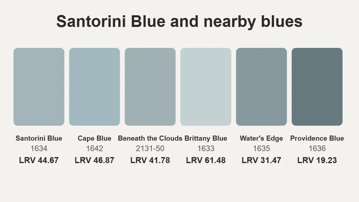
These official numbers show how the nearby blues compare:
| Color | Code | LRV | Hex |
|---|---|---|---|
| Santorini Blue | 1634 | 44.67 | A2B4BA |
| Nantucket Fog | AC-22 | 45.02 | Not listed |
| Cape Blue | 1642 | 46.87 | A1BAC0 |
| Beneath the Clouds (Nimbus Gray) | 2131-50 | 41.78 | A1B0B4 |
| Brittany Blue | 1633 | 61.48 | C3D0D2 |
| Water’s Edge | 1635 | 31.47 | 86989E |
| Providence Blue | 1636 | 19.23 | 66797F |
One competing guide gives different LRVs for four of these colors: Brittany Blue 58.2, Cape Blue 46.8, Water’s Edge 34.6 and Providence Blue 29.7. Only Cape Blue is close, and the official figures are used here.
Santorini Blue vs Nantucket Fog
The official Nantucket Fog AC-22 page says it is also known as Santorini Blue 1634, so Benjamin Moore lists them as the same color under two names. The pages list slightly different LRVs, 45.02 and 44.67, and different collections, America’s Colors and Classics, so compare chips if an exact match matters.
Santorini Blue vs Cape Blue
Cape Blue 1642 is described officially as a refreshing blue with gray undertones, and its LRV of 46.87 is slightly higher than Santorini Blue. One guide calls Cape Blue greener, and another calls it deeper and cozier, which conflicts with the official LRV that makes it slightly lighter.
Santorini Blue vs Nimbus Gray
Nimbus Gray 2131-50, officially Beneath the Clouds, has an LRV of 41.78, so it is slightly darker. The official page calls it a medium blue-gray, and one competing guide calls it softer and calmer than Santorini Blue.
Santorini Blue vs Slate Blue and Colorado Gray
The official page lists Slate Blue 1648 and Colorado Gray 2136-50 as similar but gives no values here. One competing guide calls Slate Blue deeper and more muted, and Colorado Gray subtler.
Santorini Blue vs Hale Navy and Ocean Air
One designer places Santorini Blue between the darker Hale Navy and the very pale Ocean Air. No official numbers were checked for those two colors.
How Do You Test Benjamin Moore Santorini Blue Before Buying?
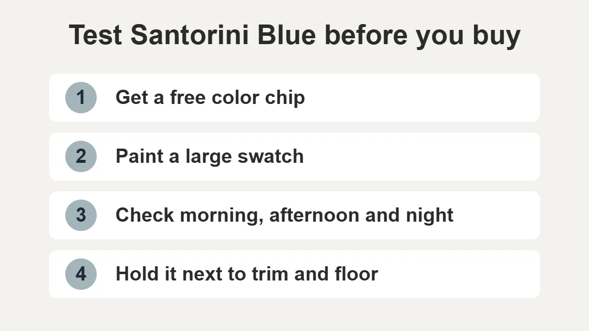
Test a paint sample swatch before committing, because screens and small chips mislead. The official US page offers a digital swatch download and free color chips at local Benjamin Moore stores, and notes that screen colors may differ. The UK page sells a peel and stick sample and a 236 ml color sample, and the US page does not list sample sizes. One guide warns against judging the color from a small chip and suggests checking a large area at different times of day. Hold the swatch next to your trim and floor, not on a blank wall.
Which Benjamin Moore Paint Comes in Santorini Blue?
The official Aura interior paint page lists Santorini Blue 1634 in matte, with eggshell, satin and semi-gloss also offered. It lists VOC under 50 g/L, coverage of 350 to 400 square feet per gallon, 1 hour to dry, 1 hour to recoat, and 1 or 2 coats. It works on drywall, plaster, wood, masonry, brick and concrete, goes on by roller, brush or spray at 50 to 90 degrees F, and cleans up with soap and water.
The official Ben interior paint page did not load during research, so no Ben interior paint specs are stated. The Aura page shows a price, but it does not say which size the price covers, so no price is quoted.
What Should You Avoid With Santorini Blue?
These are opinions from competing guides:
- Orange and rust accents that fight its cool undertones
- Yellow-toned lighting that can make it look muddy
- Heavy dark wood furniture in a small room
- Burgundy, mauve or rose upholstery
- Gold or brass accents that can look dingy
- Busy patterned wallpaper
- Judging it from a small paint chip
How Do You Paint Walls With Santorini Blue?
One competing guide suggests cleaning and repairing walls, priming over a darker color, rolling with a medium-nap roller, cutting in with an angled brush, painting in low humidity and keeping a wet edge. Test a large area first, and plan for two coats. The Aura page gives a 1 hour recoat time.
Is Benjamin Moore Santorini Blue Right for Your Home? Final Verdict
Choose Santorini Blue if you want a calm, mid-tone blue with a gray edge for rooms with decent natural light, white or soft neutral trim and natural wood. Skip it if your room is dim, your palette is warm or you want a bold statement color. If you want something lighter, the official pages list Brittany Blue 1633 at an LRV of 61.48, and for more depth they list Water’s Edge 1635 at 31.47. Whatever you choose, check the official code 1634 and LRV 44.67, and test a swatch before you buy.
FAQs
What are the undertones of Benjamin Moore’s Santorini blue?
The official page names gray as its only undertone and lists it in the Blue Gray subfamily. Some guides mention green, and others list lilac or mint, but those claims are not official.
Is Santorini blue the same as Nantucket fog?
Benjamin Moore’s Nantucket Fog AC-22 page says it is also known as Santorini Blue 1634, so Benjamin Moore lists them as the same color under two names. The pages list LRVs of 45.02 and 44.67, so compare chips.
What colors go with Santorini blue?
The official coordinating colors are Cloud White 967, White Sand 964, Distant Gray OC-68 and Wolf Gray 2127-40. Competing guides add Simply White OC-117 and Linen White OC-146 for trim.
What color is Benjamin Moore’s Santorini blue?
It is a cool, mid-tone, muted dusty blue with a touch of gray. The official specs are code 1634, LRV 44.67 and hex A2B4BA, in the Classics collection.
What color is Santorini blue?
In paint terms, it is a soft blue gray that reads calm and slightly dusty. Guides say it looks bluer in bright light and flatter or grayer in dim rooms, but no official lighting data exists, so test a swatch.
What Sherwin Williams color is closest to Benjamin Moore Santorini blue?
Benjamin Moore publishes no Sherwin Williams equivalent, and no competing guide names one. A third-party matching site lists Languid Blue SW 6226 first, but that is an estimate, so compare chips side by side.
What is Benjamin Moore’s most popular blue?
No official ranking was found in the sources checked, so none is claimed. Some guides call Santorini Blue popular, but no sales data supports a ranking.
What are the most popular blue paint colors for 2026?
No source checked ranks 2026 blues, so no ranking is claimed. If you like muted blue grays, Santorini Blue is a documented option to test.
What color makes blue pop the most?
Crisp white trim is the best-supported answer: one guide says Simply White OC-117 gives contrast that emphasizes the blue. Natural wood adds warmth, but one guide warns that orange and rust accents clash with it.
Is Benjamin Moore a better quality paint than Sherwin Williams?
No neutral test was checked, so no winner is claimed. Benjamin Moore says it ranks number one in customer satisfaction for interior paints by J.D. Power, which is a company claim. Compare specific product lines, such as the Aura specs above.