Vintage Vogue Benjamin Moore 462 Review: A Smoky Dark Green
Introduction
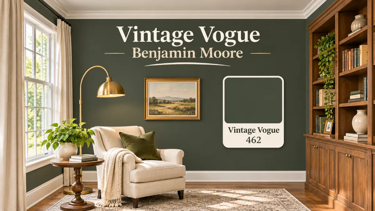
Quick answer: Vintage Vogue Benjamin Moore 462 is a deep, smoky green with a Light Reflectance Value (LRV) of 11.85. It sits between dark sage green and charcoal, with gray, brown and black undertones that keep it earthy instead of bright. It is warm-leaning and muted, so it feels calm and grounded rather than loud. It shines on cabinets, built-ins, dining rooms, offices and well-lit living rooms, and it needs care in small, dim spaces.
If you love dark green but find most versions too blue, too minty or too bold, this one may be your answer. It reads as a green that has been softened with smoke and soil, which is why designers reach for it when they want drama without a harsh edge.
This Vintage Vogue Benjamin Moore review covers what the color really looks like, how light changes it, what to pair it with, how it compares with Dark Olive, Backwoods and Hunter Green, and which Sherwin-Williams color comes closest. Read to the end for room-by-room advice, a sampling plan and ten quick answers, so you can decide before you open a can.
Quick Facts
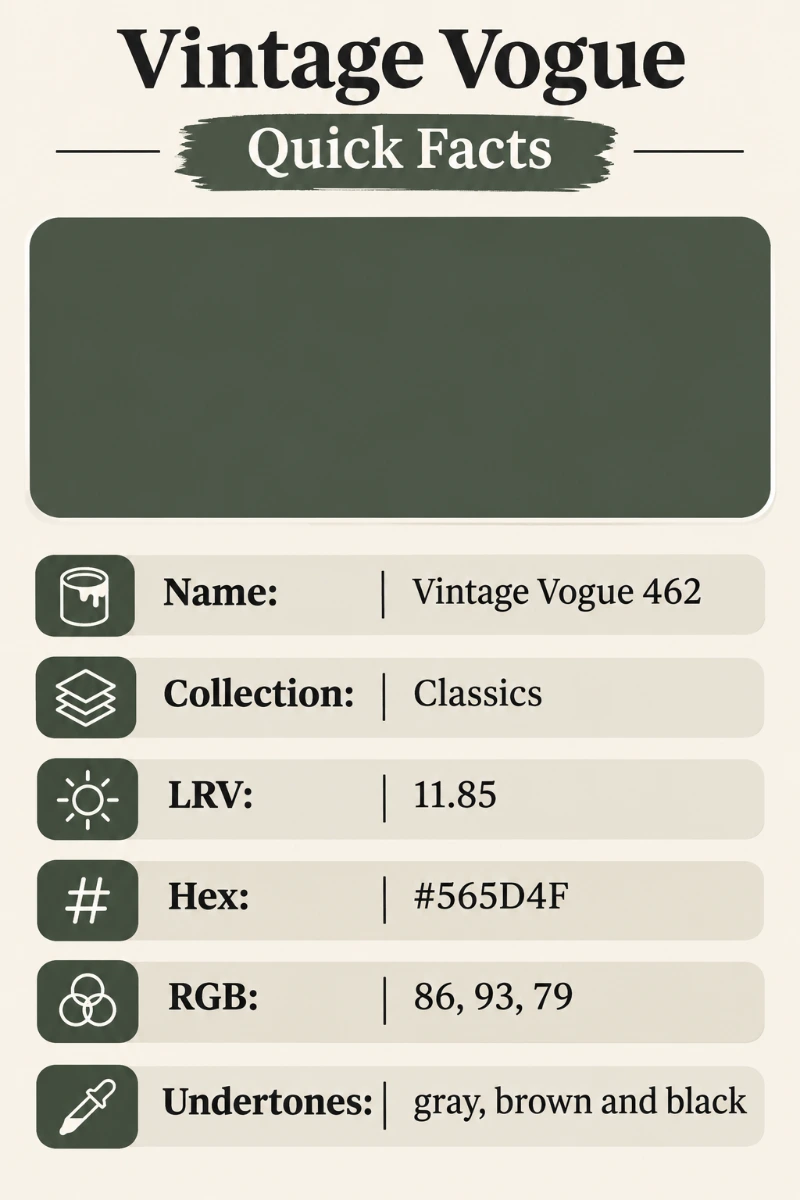
| Detail | Value |
|---|---|
| Brand | Benjamin Moore |
| Color name and number | Vintage Vogue 462 |
| Collection | Classics collection |
| LRV | 11.85 |
| Hex code | #565D4F |
| RGB | 86, 93, 79 |
| Color style | Smoky, dark sage green |
| Undertones | Gray, brown and black |
| Official description | An ultra-dark, smoky green that can stand in for black or brown |
Light Reflectance Value, or LRV, runs from 0 (pure black) to 100 (pure white). A score of 11.85 means this paint reflects only a small share of the light that hits it. It absorbs most of the light in a room, which is why it feels rich and cozy, and also why it needs good lighting.
Who This Color Is For
This paint suits people who want a moody, sophisticated green that still feels natural. It works for homeowners who like wood tones, brass, leather and linen, and for anyone who wants a dark color that is softer than black. It is a strong fit for traditional, modern organic, farmhouse and cottage styles.
It is less suited to people who want a bright, fresh green, or to rooms with almost no natural light. If you picture lime, mint or emerald, look elsewhere.
What Color Is Vintage Vogue Benjamin Moore?
In plain words, it is a dark green that leans gray. Think of old pine needles in shade, moss on wet stone, or the green of a well-worn leather chair. Benjamin Moore calls it an ultra-dark, smoky green, and many reviewers describe it as a dark sage. In a bright room it reads clearly green. In a dim room it settles toward charcoal.
The numbers explain why. Its RGB value is 86, 93, 79. Green is the highest channel, but only by a small margin, so the color is heavily muted. That quiet green is the reason it feels sophisticated instead of bold.
Benjamin Moore Vintage Vogue Undertones
Benjamin Moore does not publish undertone names, and reviewers describe this color a little differently, so treat the notes below as observations.
- Gray undertones: The most common report. They soften the green and keep it from looking saturated.
- Brown undertones: An earthy, warm note that shows in natural light and beside wood.
- Black undertones: A deep base that grows stronger in low light and makes the color feel almost charcoal.
Because these undertones are balanced, the color rarely looks blue or minty. If you have seen reviews that call it olive, they are usually describing the warm brown side. If you have seen reviews that call it gray-green, they are describing the cooler side. Both are real, and which one you see depends on your light.
Is Vintage Vogue Benjamin Moore Warm or Cool?
It is a warm green with a muted, balanced feel. Its green channel is higher than red, and red is higher than blue, which places it on the yellow-green side of the wheel rather than the blue-green side. Some reviewers call it neutral because the gray and black soften the warmth. In practice, it behaves like a warm-neutral green: it pairs naturally with wood, brass and cream, and it looks flat beside icy chrome and bright blue-whites.
Vintage Vogue Benjamin Moore LRV
The LRV is 11.85, a very low value that places the color in the dark range. The current official Benjamin Moore page lists 11.85. Some older listings and articles show an LRV of 10, so you may see both numbers online. This guide uses 11.85 because it is the manufacturer’s current figure.
What does that mean in your home?
- Walls feel deep and enclosed, which is cozy in a library and heavy in a closet-sized room.
- Furniture, art and white trim stand out sharply against it.
- You need good light, either natural or artificial, to keep the color from turning black.
Lighter and Darker Versions of Vintage Vogue
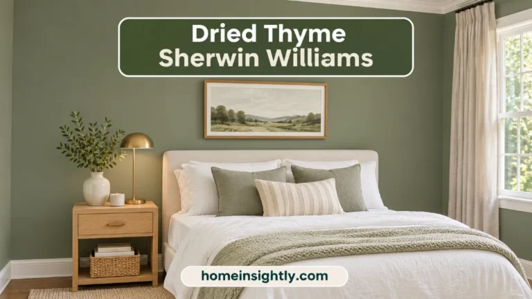
On the Benjamin Moore color strip, the lighter neighbor is Rosepine 461 (LRV 20.82, hex #737E6B). It has the same family feel in a softer, mid-tone green. There is no darker step on the strip. For a similar mid-tone, earthy green from Sherwin-Williams, Dried Thyme SW 6186 (LRV 21) sits in the same range.
If you want a similar color that is a touch lighter, Benjamin Moore Boreal Forest AF-480 (LRV 12.17), Backwoods 469 (LRV 12.68) and Dark Olive 2140-30 (LRV 13.52) are all slightly lighter. If you want deeper, Hunter Green 2041-10 (LRV 6.39) is much darker, but it is a bluer green, so it changes the mood. If you want something close to black, Essex Green HC-188 (LRV 5.64) is another deep Benjamin Moore green worth comparing.
How Light Changes the Color
| Room exposure | What you will see |
|---|---|
| North-facing rooms | Cooler, dimmer light pushes it toward charcoal. Gray and black lead. |
| South-facing rooms | Bright, warm light shows the green clearly and lifts the sage character. |
| East-facing rooms | Bright and a bit golden in the morning, then deeper and calmer later. |
| West-facing rooms | Quiet and muted in the morning, then warm and rich in the evening. |
| Warm bulbs | Bring out the brown and olive warmth. |
| Cool LED bulbs | Pull it toward gray and mute the green. |
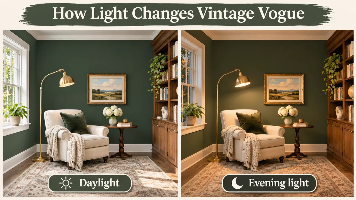
For the best result in a dim room, add warm light at several heights, such as sconces and table lamps, instead of relying on one ceiling fixture.
The Mood: What This Color Feels Like
Dark greens often feel calming because they remind us of forests and gardens. This one is more subdued than most. It feels private, studious and grounded. In a study it encourages focus. In a bedroom it feels like a retreat. In a dining room it makes candlelight look warmer. If you want a room that feels energetic and airy, this is not the color. If you want a room that feels like a hug, it is.
Vintage Vogue Benjamin Moore Trim Colors
The best trim for a dark green is either a clean, soft white that gives crisp contrast or the same color for a seamless look. These are the most reliable whites, with official Benjamin Moore values.
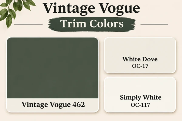
| White | Code | LRV | Hex | Best for |
|---|---|---|---|---|
| White Dove | OC-17 | 83.16 | #EFEEE5 | A soft, warm white. The safest and most popular match. |
| Simply White | OC-117 | 89.52 | #F6F6ED | A brighter white with a slightly cleaner edge. |
| Chantilly Lace | OC-65 | 90.04 | #F4F6F1 | The crispest, most contrasting trim. |
Pick White Dove for a classic, warm look. Pick Chantilly Lace if you want a sharp, gallery feel. For a modern drenched look, paint walls, trim and doors in the same color, using eggshell on walls and semi-gloss on trim so the details still show. Natural oak and walnut trim also look excellent next to this green.
Vintage Vogue Benjamin Moore Coordinating Colors
The official Benjamin Moore page lists four coordinating colors: Muslin OC-12, Beach House Beige 1083, Dewdrop CC-608 and Tea Light CC-610. Muslin is a soft, creamy neutral with an LRV of 66.54 and a hex of #E1D6C1, and it makes a gentle partner for walls next to the green. The others are light, warm neutrals that work as quiet backdrops.
What Colors Go With Vintage Vogue Benjamin Moore?
Warm neutrals, soft whites and earthy accents all work. Good options include:
- Revere Pewter HC-172 (LRV 55.05): a warm greige for adjoining rooms.
- Balboa Mist OC-27 (LRV 65.53): a light, airy greige for hallways and ceilings.
- Cream and oatmeal: for upholstery, curtains and rugs.
- Brass, bronze and copper: warm metals that suit the earthy undertones.
- Natural wood: oak, walnut and rattan add warmth.
Cool chrome and polished nickel can feel cold against it, so use them sparingly.
Complementary Colors
Complementary colors sit opposite green on the color wheel. For this muted green, the best partners are soft reds and warm earth tones.
- Terracotta and warm clay for pillows, pottery and art.
- Rust and burnt orange for a bold accent.
- Dusty rose and blush for a softer, romantic contrast.
- Mustard and ochre for a vintage feel.
Keep these in small to medium amounts so the green remains the star.
Vintage Vogue Benjamin Moore Color Palette
Here are three palettes that show how the color can lead a room.
| Palette | Main color | Supporting colors | Materials |
|---|---|---|---|
| Classic library | Vintage Vogue 462 | White Dove trim, Muslin accents | Walnut shelving, brass lamps, leather |
| Modern organic | Vintage Vogue 462 | Simply White walls nearby, Balboa Mist hallway | Light oak, linen, black metal |
| Warm cottage | Vintage Vogue 462 | White Dove trim, Revere Pewter neighbor | Rattan, terracotta, aged brass |
Popular Design Styles
This color fits many styles because it feels timeless.
- Traditional and English country: with paneled walls, brass and rich fabrics.
- Modern organic: with light wood, linen and plants.
- Farmhouse: on cabinets and islands next to white walls.
- Cottage and vintage: with floral prints and antique finds.
- Moody minimalist: with black metal, stone and one bold piece of art.
Using This Color in Your Home
Different rooms ask different things of a dark color. Here is how it performs in each.
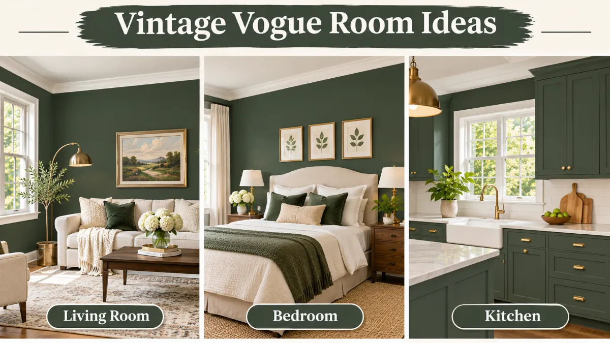
Vintage Vogue Benjamin Moore Living Room
In a living room with large windows, this color looks like a sophisticated, enveloping backdrop. It makes cream sofas, leather chairs and wood tables look rich. In a living room with limited light, use it on one wall or on built-ins and keep the other walls lighter. A pale rug and bright lamps keep the space from feeling heavy.
Vintage Vogue Benjamin Moore Bedroom
A bedroom in this color feels like a retreat. The color creates a cozy, cocoon-like feel that supports sleep and relaxation. Pair it with linen bedding in cream or oatmeal, warm lamps and a wood headboard. If the bedroom faces north, use warm bulbs and consider a feature wall instead of all four walls. Eggshell gives the walls a soft, velvety finish.
Vintage Vogue Benjamin Moore Kitchen Cabinets
This is one of its best uses. It works well on lower cabinets and islands, especially paired with lighter upper cabinets or white walls. Brass or bronze hardware, marble or butcher block counters and warm wood stools all look excellent against it. Use a durable cabinet-grade paint in satin or semi-gloss, since darker colors show wear and fingerprints more than light ones. Matte black appliances can look heavy beside it, so test the combination first.
Bathroom
On a vanity, it looks rich beside white tile and brass fixtures. On walls, it works best in a bathroom with a window. Use satin for moisture resistance and add warm lighting at the mirror.
Dining Room
Dining rooms are used mostly in the evening, and that is when this green is at its best. Candles and warm bulbs bring out the warm side of the color, and dishes, wood tables and glassware stand out beautifully.
Home Office and Library
Libraries and home offices are the ideal use. The color lowers visual noise and supports focus, and it makes books, art and wood furniture look rich. Paint built-in shelves the same color for a cozy, tailored look.
Built-Ins, Wainscoting and Accent Furniture
If you are nervous about painting walls, start small. Built-ins, wainscoting, a bookcase, a dresser or a bench look striking in this color and are easy to repaint if you change your mind. Wainscoting is also a good way to bring the color into a low-ceilinged room.
Vintage Vogue Benjamin Moore Exterior
On the outside, the color looks natural against trees and gardens. It works on shutters, doors, trim and even siding on cottages and traditional homes. Dark colors absorb heat, so check the manufacturer guidance for exterior use in hot climates and test a large patch in sun and shade first. For a front door, pair it with brass hardware and a white or cream frame.
Can You Use It as a Whole-House Color?
Not usually. Because the LRV is so low, painting every room in this shade would make most homes feel dark and heavy. It works best as a repeating accent: cabinets in the kitchen, a dining room, an office and a door or two. If you want a connected feel, use a light neutral such as Balboa Mist through the main spaces and bring in the green in selected rooms.
Choosing the Right Finish
- Eggshell: a soft, low sheen that suits living rooms and bedrooms.
- Satin: more durable and easier to clean. Good for high-traffic areas, kitchens and bathrooms.
- Semi-gloss: hard-wearing and crisp. Best for trim, doors and cabinets.
Darker paint shows flaws more, especially in glossier finishes, so prepare walls well. Matte and eggshell hide imperfections better than satin or gloss.
How to Sample and Apply It
Never choose a dark color from a screen or a tiny chip. Dark paint changes dramatically with light, and a mistake costs two or three coats to fix.
- Use large samples. Paint a sample pot on a white board at least two feet by two feet, or use a peel-and-stick sample. Large samples show how the color behaves, not just what it looks like in a small square.
- Test on more than one wall. Look at the color on a wall that gets bright light and one that is shaded.
- Watch it all day. Check morning, noon, evening and under lamps.
- Hold it beside fixed items. Compare it with your flooring, counters, tile and furniture.
- Compare similar colors. Place Backwoods, Dark Olive and Vintage Vogue side by side.
- Prime properly. A gray-tinted primer helps dark colors cover evenly.
- Plan on two coats. Many dark colors need at least two finish coats for full depth.
- Control the environment. Paint in moderate temperature and humidity, and use quality brushes and rollers for a smooth finish.
Benjamin Moore paint is sold through its dealers. Ask for the color by code (462) and confirm the finish before the can is mixed. If you want to see it beside real products, take your sample to the store to compare against tile and countertops.
Budget, Coats and Upkeep
Dark colors cost more in time than in paint. Expect to buy slightly more paint than you would for a light neutral, because deep shades often need a tinted primer and two full coats. Quality paint matters here: it spreads evenly, hides roller marks and holds its depth over time. Ask your dealer for a premium line suited to the surface, such as a cabinet-grade enamel for doors and cabinets.
Upkeep is straightforward. Dark walls show dust and scuffs more than light ones, so wipe them gently with a soft damp cloth. Keep a small labeled jar of leftover paint for touch-ups, and apply it with a small brush, feathering the edges so the patch blends in. Stir the paint thoroughly before use, since pigment settles over time.
Comparisons: How It Differs From Other Dark Greens
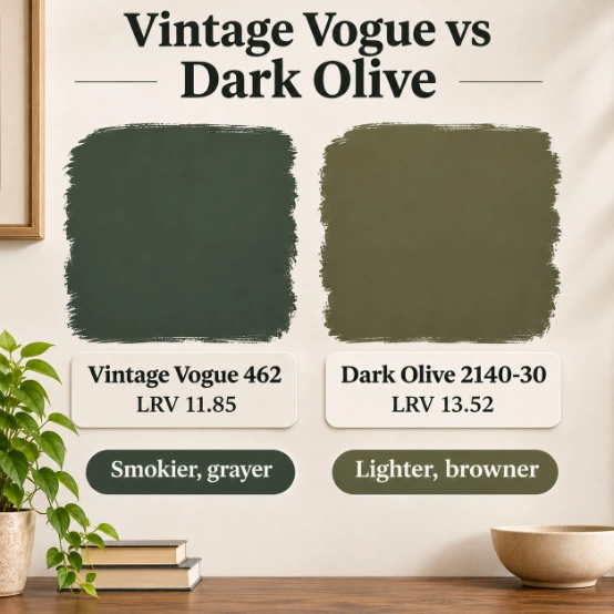
Vintage Vogue Benjamin Moore vs Dark Olive
Dark Olive 2140-30 has an LRV of 13.52 and a hex of #616253. It is slightly lighter and noticeably browner and more olive. Vintage Vogue is more green and a little deeper. Choose Dark Olive for a warm, earthy, olive-brown feel. Choose Vintage Vogue for a smokier, greener look.
Vintage Vogue Benjamin Moore vs Backwoods
Backwoods 469 has an LRV of 12.68 and a hex of #586251. It is slightly lighter and a little more green, with less brown. If your room has less light and you want the color to read clearly green, Backwoods can be the better choice. If you want a moodier, smokier feel, Vintage Vogue wins.
Vintage Vogue Benjamin Moore vs Hunter Green
Hunter Green 2041-10 has an LRV of 6.39 and a hex of #2A453D. It is much darker and a saturated, blue-leaning green. Vintage Vogue is muted and warm. Choose Hunter Green for a formal, high-contrast look, and Vintage Vogue for a softer, earthier one.
Other Close Benjamin Moore Greens
| Color | Code | LRV | Hex | Difference |
|---|---|---|---|---|
| Vintage Vogue | 462 | 11.85 | #565D4F | The base color |
| Dakota Shadow | 448 | 11.6 | #515D51 | Very close in depth, a touch grayer |
| Boreal Forest | AF-480 | 12.17 | #535F4E | Slightly lighter and a little cooler |
| Backwoods | 469 | 12.68 | #586251 | Slightly lighter, more clearly green |
| Dark Olive | 2140-30 | 13.52 | #616253 | Lighter, browner and more olive |
| Rosepine | 461 | 20.82 | #737E6B | A much lighter mid-tone green |
| Hunter Green | 2041-10 | 6.39 | #2A453D | Much darker, bluer and more saturated |
Vintage Vogue Benjamin Moore Sherwin Williams Equivalent
No match between brands is exact, but these Sherwin-Williams colors come close, with values from the Sherwin-Williams color pages.
| Sherwin-Williams color | Code | LRV | Hex | Difference |
|---|---|---|---|---|
| Rookwood Dark Green | SW 2816 | 10.075 | #565C4A | Closest by hex. Slightly darker and warmer. |
| Pewter Green | SW 6208 | 11.826 | #5E6259 | Closest by LRV. Grayer and a little lighter in color. |
| Rosemary | SW 6187 | 13.561 | #64695C | Lighter, warmer and grayer. |
| Vogue Green | SW 0065 | 8.566 | #4B5645 | Darker and more saturated. |
| Forestwood | SW 7730 | 8.276 | #4D5346 | Darker and deeper. |
If you want the closest look, start with Rookwood Dark Green. If you want a grayer, softer version, try Pewter Green. Reviewers also suggest Behr Pastoral (PPU10-20) and Valspar Flora (5004-2C) as budget alternatives, but those values were not confirmed from the brand pages, so compare them against a physical sample.
If the Color Looks Wrong in Your Room
Dark greens can surprise you. These quick fixes cover the most common complaints.
- It looks almost black: add light. Switch to warm bulbs, add a second lamp at a different height and open the curtains. A lighter rug and pale bedding also lift the whole room.
- It looks too gray: warm the room with brass, wood and cream textiles, and use warmer bulbs. The brown undertone will come forward.
- It looks too green: neutralize it with warm clay, rust or oatmeal accents, and avoid pairing it with blue-based whites.
- It looks flat: change the finish or add texture, such as paneling, a slatted wood accent or a wool rug. Texture gives dark color depth.
- The room feels heavy: paint the ceiling a light warm white and keep trim bright, so the dark walls have a clear edge.
Where This Color May Not Work
- Small, windowless rooms: the color will look black and feel closed in.
- Dim north-facing rooms with low ceilings: without good lighting, it can feel heavy.
- Children’s rooms where you want bright energy: it is a calm color, not a playful one.
- Homes with cool gray flooring: the brown and black undertones can clash. Test it beside the floor.
- Anywhere you want an airy feel: a lighter sage will serve you better.
Quick Decision Guide
| If you want | Choose |
|---|---|
| A smoky, muted green with gray and black depth | Vintage Vogue 462 |
| A browner, more olive green that is slightly lighter | Dark Olive 2140-30 |
| A clearer green for a room with less light | Backwoods 469 |
| A formal, deep, blue-leaning green | Hunter Green 2041-10 |
| A grayer Sherwin-Williams option | Pewter Green SW 6208 |
| The closest Sherwin-Williams look | Rookwood Dark Green SW 2816 |
Pros and Cons
Pros
- Rich, sophisticated and easy to live with.
- Softer and more natural than black, navy or forest green.
- Pairs well with wood, brass and cream.
- Works across traditional and modern styles.
- Looks beautiful on cabinets, doors and built-ins.
Cons
- Very low LRV, so it needs good light.
- Undertones shift with lighting and bulbs.
- Needs careful sampling and often two coats.
- Overuse can make a room feel heavy.
- Hard to match exactly in other brands.
Final Thoughts
This is a smoky, earthy green that feels like it has always belonged in a well-loved home. It is deep without being harsh, natural without being dull, and flexible enough for kitchens, libraries, bedrooms and front doors. Its one real demand is light and a proper sample test, and in return it gives you a warm, grounded space that never feels trendy.
Ready to try it? Order a sample pot or a peel-and-stick sample of Vintage Vogue 462 today, put it beside your flooring and trim, and watch it for a full day. Then tell us how it looked in your home.
How This Guide Was Prepared
The color code, LRV, hex value, collection and coordinating colors for Vintage Vogue come from Benjamin Moore’s official color pages, and the RGB value is converted from the official hex. The current official page lists an LRV of 11.85, while some older listings show 10, so this guide uses 11.85. The Benjamin Moore comparison colors come from their own pages, and the Sherwin-Williams values come from the Sherwin-Williams color pages. Undertone descriptions are not published by either brand, so they reflect reviewer observations and the color’s numeric values. Always confirm with a physical sample.
Frequently Asked Questions
What are the undertones of Vintage Vogue by Benjamin Moore?
It has gray, brown and black undertones over a muted green base. The black grows stronger in low light, and the brown shows in warm, natural light.
What colors go well with Vintage Vogue by Benjamin Moore?
White Dove, Simply White and Chantilly Lace work as trim, and Muslin, Revere Pewter and Balboa Mist make soft neighbors. Brass, oak, cream and terracotta suit it well.
Is Vintage Vogue Benjamin Moore warm or cool?
It is warm-leaning but muted. Its yellow-green balance and brown undertones make it feel earthy, while the gray and black keep it calm.
What is the difference between Benjamin Moore Dark Olive and Vintage Vogue?
Dark Olive (LRV 13.52) is slightly lighter and browner. Vintage Vogue (LRV 11.85) is deeper, smokier and more clearly green.
What is the color code for Vintage Vogue by Benjamin Moore?
The code is 462, from the Benjamin Moore Classics collection. Its LRV is 11.85 and its hex is #565D4F.
What are some popular color palettes that include Vintage Vogue by Benjamin Moore?
Popular combinations are White Dove trim with brass and walnut for a classic library, Simply White with light oak for modern organic, and Revere Pewter with terracotta for a warm cottage.
What are some popular design styles that incorporate Vintage Vogue by Benjamin Moore?
It suits traditional and English country, modern organic, farmhouse, cottage and moody minimalist styles, especially on cabinets, built-ins and libraries.
What trim colors go with Benjamin Moore Vintage Vogue?
White Dove OC-17 is the safest trim. Simply White OC-117 is brighter, and Chantilly Lace OC-65 gives the crispest contrast. You can also paint trim the same color.
Is Vintage Vogue too dark for a small room?
It can be. With an LRV of 11.85, it needs good natural or layered artificial light. In a small, dim room, use it on one wall, cabinets or built-ins instead.
Can I use Benjamin Moore Vintage Vogue for the whole house?
Usually no. It is too dark to repeat in every room. Use it as a repeating accent in a kitchen, dining room, office or doors, and keep a light neutral elsewhere.