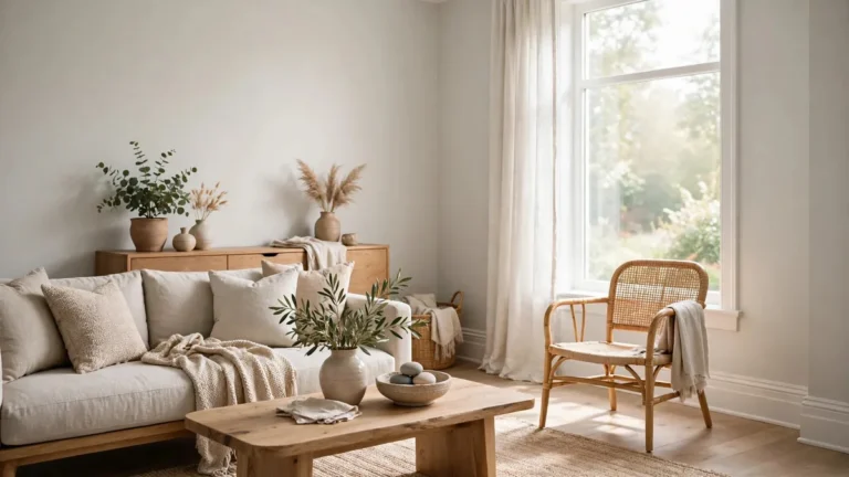
Dover White Sherwin-Williams: Paint Color Review and Uses

Dover White Sherwin-Williams is a warm, creamy white that brings a soft, welcoming appearance to interior and exterior spaces. Identified as Dover White SW 6385, this popular paint color has noticeable yellow undertones that distinguish it from cleaner, cooler, or more neutral white paints.
Unlike a crisp, bright white, Dover White offers a subtle creaminess that can complement natural wood, warm neutrals, traditional interiors, and comfortable farmhouse-inspired spaces. However, its appearance depends on the room’s lighting, surrounding finishes, and other colors in the palette. In some settings, its yellow undertones may look stronger than expected.
This guide explains the Dover White Sherwin-Williams paint color, its technical specifications, undertones, coordinating colors, interior and exterior applications, and how to determine whether it suits your home.
What Is Dover White Sherwin-Williams SW 6385?
Dover White SW 6385 is a warm white paint with a creamy appearance and yellow undertones. It belongs to the white color family, although its warmth makes it look different from a stark or pure white.
The color works well when you want a space to feel softer and more inviting without moving toward a distinctly beige or yellow wall color. It can provide a light background for wood furniture, natural flooring, traditional cabinetry, and earthy decorative materials.
Here are the key color specifications:
| Color specification | Details |
|---|---|
| Paint name | Dover White |
| Brand | Sherwin-Williams |
| Color code | SW 6385 |
| Color category | Warm white paint |
| Main undertone | Yellow |
| Light Reflectance Value | 82.52 |
| HEX color code | #F0EADC |
| RGB | 240, 234, 220 |
| General appearance | Soft, creamy, warm white |
| Typical applications | Interior walls, cabinets, trim, and suitable exterior surfaces |
These digital specifications help identify the shade, but they cannot guarantee how the paint will look on your walls. Screen brightness, surrounding colors, paint finish, and natural and artificial lighting can all affect the perceived result.
What Undertone Is Dover White?
Dover White Sherwin-Williams has yellow undertones, which give it a warm, slightly creamy appearance. These undertones are more noticeable than those of many neutral whites, so the paint may look buttery or golden in certain environments.
An undertone is the subtle underlying hue that influences how a paint color appears. Two white paints can look almost identical on separate sample cards but seem noticeably different when placed next to each other.
Dover White’s yellow undertones become easier to recognize when it is compared with a cleaner white, especially in bright light or beside cool gray finishes.
Its main characteristics include:
- Warm undertones: These create a comfortable, inviting atmosphere.
- Subtle yellow tones: These give the color its creamy, sunlit appearance.
- Creamy neutral character: Dover White can work as a light background for warm furnishings and natural materials.
- Soft white appearance: It is lighter and less visually heavy than many beige paints, but warmer than a crisp white.
Dover White Sherwin-Williams is best understood as a warm, creamy off-white rather than a neutral white that will look the same in every room.
Is Dover White Sherwin-Williams Warm or Cool?
Dover White Sherwin-Williams is a warm white, not a cool white. Its yellow undertones give it a softer and more sunlit appearance than whites with blue, violet, or distinctly cool gray undertones.
This warmth can be useful in rooms that feel visually cold because of gray flooring, cool daylight, or limited sunlight. However, the result depends on the other finishes in the space.
For example, Dover White may complement honey oak flooring, warm wood furniture, cream-colored textiles, and earthy stone. When paired with icy gray walls or very cool white cabinetry, its yellow undertones may become more obvious.
Choose it when you want warmth to be part of your design. Consider a more balanced white if you prefer a cleaner, less creamy appearance.
Is Dover White Too Yellow?
Dover White Sherwin-Williams can look too yellow for some interiors, particularly when the goal is a neutral, contemporary white. Its yellow undertones are a defining part of the color rather than an unusual effect that appears only under certain lighting.
Whether it looks overly yellow depends on three important factors.
First, warm artificial lighting can strengthen its creamy appearance. Second, neighboring white or gray surfaces may make its yellow undertones easier to notice by comparison. Third, existing materials such as orange-toned wood, yellow-beige stone, or warm countertops can intensify the overall warmth of the room.
If you like the softness of Dover White but worry about excessive yellow, test it beside your actual flooring, countertops, furniture, and trim before committing.
If your preference is for a restrained, versatile white with minimal visible yellow, compare it with other options such as Sherwin-Williams Alabaster or Pure White. They have different undertones, so the best choice depends on your existing finishes and desired appearance.
What Is the LRV of Dover White SW 6385?
Dover White Sherwin-Williams has an official Light Reflectance Value (LRV) of 82.52. LRV describes how much visible light a surface reflects on a scale from 0, representing black, to 100, representing a perfectly reflective white.
An LRV in the low 80s places Dover White among light paint colors. It can help a room feel bright while retaining a warm, creamy character.
However, light reflection and perceived brightness are not the same thing. A room with large windows and abundant daylight will generally show a paint color differently from a room with small windows, shaded exposures, or limited artificial lighting.
Dover White’s LRV also does not mean that it will appear like a bright, stark white. Its yellow undertones influence the way the eye perceives the color, even though its reflectance value is relatively high.
What Are the HEX and RGB Values of Dover White?
The digital color values for Dover White Sherwin-Williams SW 6385 are:
| Format | Color value |
|---|---|
| HEX color code | #F0EADC |
| RGB | 240, 234, 220 |
These codes are useful for digital mood boards, preliminary design mockups, and comparing paint colors on a screen. They are not substitutes for a physical paint sample because digital displays cannot reproduce every aspect of an actual painted surface.
For paint selection, use these values as a reference and evaluate the real color in your intended environment.
How Does Dover White Look Under Different Lighting?
Lighting can significantly change the appearance of Dover White Sherwin-Williams. Although the paint retains its underlying yellow undertones, those undertones may appear stronger or softer depending on the light source, room orientation, surrounding surfaces, and time of day.
Natural Lighting and Sunlight
Natural lighting changes throughout the day, affecting the appearance of warm white paint.
In a north-facing room, daylight may feel cooler, which can make Dover White’s warmth more noticeable by contrast. Direct sunlight in a bright room can make the paint look lighter, while warm evening sunlight may strengthen its creamy or golden appearance.
East-facing rooms receive stronger morning sunlight, while west-facing rooms often experience warmer afternoon and evening light. These changing conditions can make the same wall look different from morning to night.
Room orientation is therefore important when selecting a white paint color.
Artificial Lighting and LED Bulbs
Artificial lighting can also affect Dover White’s appearance.
Warm LED bulbs often emphasize its creamy and yellow undertones. Neutral or cooler LED bulbs may make the color feel less golden, although the result varies according to bulb temperature, brightness, and the room’s other lighting sources.
Pay attention to the lighting you actually use rather than evaluating a sample only under showroom lights.
How to Evaluate Dover White in Your Room
Use the paint sample in the room where it will be applied. Observe it in the morning, afternoon, evening, and under your regular artificial lighting.
Compare the sample with the room’s existing finishes instead of judging it in isolation. This approach helps reveal whether the color feels comfortably warm or more yellow than you prefer.
Is Dover White Too White?
Dover White Sherwin-Williams is not usually the best choice for someone seeking an extremely crisp, bright white. Its creamy character distinguishes it from clean, high-contrast whites used for minimalist interiors or sharp architectural trim.
However, it is light enough to function as an off-white background in many rooms. The distinction is between its lightness and its warmth: Dover White can reflect plenty of light while still appearing creamy rather than stark.
It may be a good option when you want a softer alternative to pure white, particularly in traditional, transitional, or warm contemporary interiors.
If you want a brighter-looking white with less noticeable creaminess, compare it with Sherwin-Williams Pure White. If you prefer a more balanced warm neutral, consider sampling Alabaster alongside Dover White.
What Color Goes With Dover White?
Dover White Sherwin-Williams pairs naturally with colors and materials that work with its warm undertones. Sherwin-Williams identifies Dakota Wheat SW 9023 and Waterloo SW 9141 as coordinating colors for this shade.
Beyond those official suggestions, the most successful palette depends on whether you want to reinforce Dover White’s warmth or create deliberate contrast.
Warm Neutrals and Earthy Colors
Warm taupe, beige, sand, muted brown, and natural wood can create a cohesive palette with Dover White. These colors support its creamy character and are particularly useful in comfortable living rooms, bedrooms, and traditional interiors.
However, avoid assuming that every beige or cream will match automatically. Two warm neutrals may have different undertones and look mismatched when placed together.
Muted Blues and Greens
Soft blue and muted green can create contrast against Dover White without making the entire room feel harsh. Waterloo SW 9141 is an official coordinating option worth sampling.
Keep in mind that contrasting colors may make Dover White’s yellow tones appear more pronounced. That can be appealing when you want the warmth to stand out, but less suitable if you are trying to minimize the yellow appearance.
Charcoal and Darker Accents
Charcoal, deep brown, and other darker accents can provide definition against Dover White. These colors work well for selected furniture, hardware, doors, or decorative features.
Using darker accents can add contrast without requiring every surface to be painted in a competing white or light gray.
Choosing a Trim Color
White trim needs particular attention when Dover White is used on the walls or cabinets.
A cleaner white may create a crisp contrast, but the comparison can also make Dover White look more yellow. Matching Dover White across the walls and trim creates a softer, more continuous look, although the final effect depends on surface texture and paint finish.
Test both approaches before choosing a trim color. The best combination is the one that works with your flooring, cabinets, countertops, and overall design.
Dover White vs. Other Popular White Paint Colors
Dover White Sherwin-Williams is one of several warm and soft white options. Comparing similar paints helps clarify whether you want noticeable yellow warmth, a more restrained neutral, or a cleaner white.
| Paint color | General appearance | Main consideration |
|---|---|---|
| Dover White SW 6385 | Creamy, warm white with yellow undertones | Best when you want noticeable warmth |
| Alabaster SW 7008 | Soft white with a more restrained, balanced appearance | Worth testing if Dover White looks too yellow |
| Creamy SW 7012 | Warm, creamy white | Compare samples to decide which warmth suits the room |
| Shoji White SW 7042 | Muted warm neutral that can read greige | Consider it when you prefer a softer, less distinctly white look |
| Pure White SW 7005 | Cleaner, crisper white | Useful when you want a sharper contrast |
| White Dove OC-17 by Benjamin Moore | Soft white with a different undertone profile | Similar in lightness, but not identical to Dover White |
These descriptions are starting points, not guarantees. The same colors can look different when combined with specific finishes, lighting conditions, and room orientations.
What Is the Difference Between Dover White and Alabaster?
Dover White Sherwin-Williams has a more noticeable yellow warmth, while Alabaster generally offers a softer and more restrained appearance. Both can work in warm interiors, but they create different effects.
Choose Dover White when you want a creamy white whose warmth is visible. Consider Alabaster when you want a softer white that may be easier to integrate into a varied palette.
The most reliable comparison is to place both samples beside your flooring, countertops, and trim.
Dover White vs. Creamy
Dover White and Creamy are both warm white paint colors, so they can appear similar at first glance. Their differences may become clearer when viewed in the same lighting beside each other.
Do not rely on their names alone. Apply samples to separate boards and compare them in the room where you plan to paint.
Dover White vs. Shoji White
Dover White has a recognizable yellow-based creaminess. Shoji White has a more muted neutral appearance and can lean toward greige in some settings.
The choice depends on whether you want your walls to read as a warm white or a subdued neutral that sits closer to the beige-gray family.
Dover White vs. Pure White
Pure White is generally the better starting point for a cleaner, crisper appearance. Dover White is the better candidate when you want more visible warmth and a creamier finish.
This difference matters when selecting wall paint next to white cabinets, trim, ceilings, and other architectural details.
Is Dover White Sherwin-Williams an Equivalent to Benjamin Moore White Dove?
Dover White SW 6385 and Benjamin Moore White Dove OC-17 are separate paint colors from different manufacturers. Their Light Reflectance Values are close, with Dover White at 82.52 and White Dove at 83.16, but similar LRV values do not establish that two colors are identical.
Dover White has noticeable yellow undertones. White Dove has its own undertone profile and may look different beside the same finishes.
There is no confirmed exact Sherwin-Williams equivalent to White Dove established by these specifications alone. If you want to replace White Dove with a Sherwin-Williams color, compare several physical samples and choose the one that best matches the desired appearance.
Searches such as “Dove White paint from Sherwin-Williams” can also mix up the names. Dover White is Sherwin-Williams SW 6385, while White Dove is Benjamin Moore OC-17.
Is Dover White a Good Color for Kitchen Cabinets?
Dover White Sherwin-Williams can work on kitchen cabinets when the room benefits from a warm, creamy look. It can complement natural wood, warm countertops, traditional hardware, and earthy backsplashes.
However, cabinet color needs to be assessed alongside the fixed finishes in the kitchen. Cool gray counters, bright white backsplashes, and cooler flooring can emphasize the yellow undertones.
For a kitchen with many warm materials, Dover White may help create a coordinated appearance. For a kitchen built around crisp white surfaces or cool gray finishes, another white could be a better fit.
Before painting all the cabinets, test Dover White on a sample panel. Review it beside the countertop, backsplash, flooring, and hardware under both natural and artificial lighting.
Does Dover White Work for Living Rooms and Bedrooms?
Dover White Sherwin-Williams can be suitable for living room walls and bedroom walls when a soft, welcoming color is the goal.
In living rooms, it can complement warm wood flooring, textured rugs, beige upholstery, and traditional furniture. Darker accents can add definition and prevent a warm, neutral palette from feeling flat.
In bedrooms, the creamy appearance can support a relaxed atmosphere when paired with compatible bedding, curtains, and furniture. Warm lighting may strengthen its softness in the evening, so check the color under the bulbs you use before going ahead.
For kitchen walls, consider the cabinet color and the amount of daylight. Dover White can coordinate with warm cabinetry, but its yellow undertones may become more visible next to cooler finishes.
In every room, the practical question is whether you like the appearance under your actual lighting conditions, not simply whether the color looks attractive on a digital sample.
Is Dover White Sherwin-Williams a Good Exterior Paint Color?
Dover White Sherwin-Williams can be an attractive exterior paint color for homes where a warm, soft white complements the architecture and surrounding materials.
It may work for exterior siding, porch surfaces, and exterior trim when those applications suit the selected paint product and substrate. Sherwin-Williams lists interior and exterior uses for the color, but the correct product, surface preparation, and finish still matter.
Exterior Siding
Dover White can create a softer exterior appearance than a stark white. It may suit traditional homes, warm stone, natural wood details, and other earthy exterior materials.
Before painting the full exterior, examine a large sample against your roof, brickwork, stone, window frames, and landscaping. Outdoor daylight can change the way the yellow undertones appear.
Porch Paint and Exterior Trim
Dover White may complement porch areas and trim when a warm white supports the exterior palette. However, do not select an exterior product based on color alone.
Confirm that the paint product is suitable for the intended surface and exposure. Horizontal porch floors, railings, siding, and trim can have different preparation and durability requirements.
Test Exterior Colors Before Committing
View an exterior sample at different times of day, including direct sunlight and shade. Evaluate it beside the roof and other fixed materials rather than judging it against a white sheet of paper.
A large sample will provide a more useful impression than a small chip and help reduce the risk of choosing a color that looks too yellow across the entire facade.
How to Test Dover White Before Buying Paint
Paint samples, paint swatches, and sample chips help you assess whether Dover White Sherwin-Williams suits your home before making a larger purchase.
Start with a physical sample or sample board rather than relying only on an online color representation. Apply the sample to a movable board or an appropriate test area, following the paint manufacturer’s instructions.
Evaluate the color at different times of day and under the artificial lighting used in that room. Compare it with the surrounding trim, floor, countertops, and furniture. If your room has multiple light sources, assess the color in each of those conditions.
Finally, compare Dover White with at least one alternative, such as Alabaster or Pure White. Testing more than one paint color side by side makes it easier to identify the undertones and choose a shade that supports the overall design.
Frequently Asked Questions About Dover White Sherwin-Williams
What undertone is Dover White?
Dover White Sherwin-Williams SW 6385 has yellow undertones. These give the paint its warm, creamy appearance and may look more pronounced under warm lighting or beside cooler white and gray surfaces.
Is Dover White Sherwin-Williams warm or cool?
Dover White Sherwin-Williams is a warm white paint color. Its yellow undertones make it more suitable for palettes that welcome warmth than for designs seeking a distinctly cool white.
Is Dover White too yellow?
Dover White can look too yellow if you prefer a crisp or neutral white. Its appearance also depends on lighting and adjacent colors. Test it alongside your existing finishes to determine whether its warmth suits your space.
What color goes with Dover White?
Sherwin-Williams lists Dakota Wheat SW 9023 and Waterloo SW 9141 as coordinating colors. Warm taupe, natural wood, muted greens, and darker accents can also work, depending on your palette and the amount of contrast you want.
Is Dover White too white?
Dover White is a light color, but it is not a stark, bright white. Its creamy appearance makes it a softer alternative to cleaner whites, particularly when the goal is to create a warm interior.
Is Dover White suitable for kitchen cabinets?
Yes, Dover White Sherwin-Williams can work on kitchen cabinets, especially in kitchens with warm wood, beige stone, and compatible backsplashes. Test it beside your fixed finishes first because cooler surfaces may highlight its yellow undertones.
What is the LRV of Dover White SW 6385?
The Sherwin-Williams color record lists Dover White’s LRV as 82.52. This indicates a light color with a relatively high light-reflectance value, although the perceived brightness varies with the room and lighting.
Is Dover White a good exterior color?
Dover White can work on suitable exterior surfaces when its warm undertones complement the home’s roof, siding materials, trim, and surroundings. Always test a large sample outdoors before choosing the final paint.
What is the Sherwin-Williams equivalent to White Dove?
There is no confirmed exact equivalent based on the color specifications alone. Benjamin Moore White Dove OC-17 and Sherwin-Williams Dover White SW 6385 have similar LRVs but different undertone profiles. Compare physical samples to find the closest appearance for your project.
Conclusion
Dover White Sherwin-Williams SW 6385 is a light, creamy white defined by its warm yellow undertones. Its LRV of 82.52 makes it a relatively light paint color, while its creaminess gives it a softer appearance than a crisp, bright white.
It can suit living rooms, bedrooms, kitchens, and selected exterior applications when the surrounding colors complement its warmth. However, it may appear too yellow in rooms with cool finishes or lighting combinations that emphasize its undertones.
The best way to decide is to evaluate physical paint samples in your actual space. Compare Dover White Sherwin-Williams with your existing materials, inspect it throughout the day, and test alternatives such as Alabaster and Pure White before making a final decision.