Drift of Mist Sherwin Williams (SW 9166): Undertones, LRV, and Color Pairings
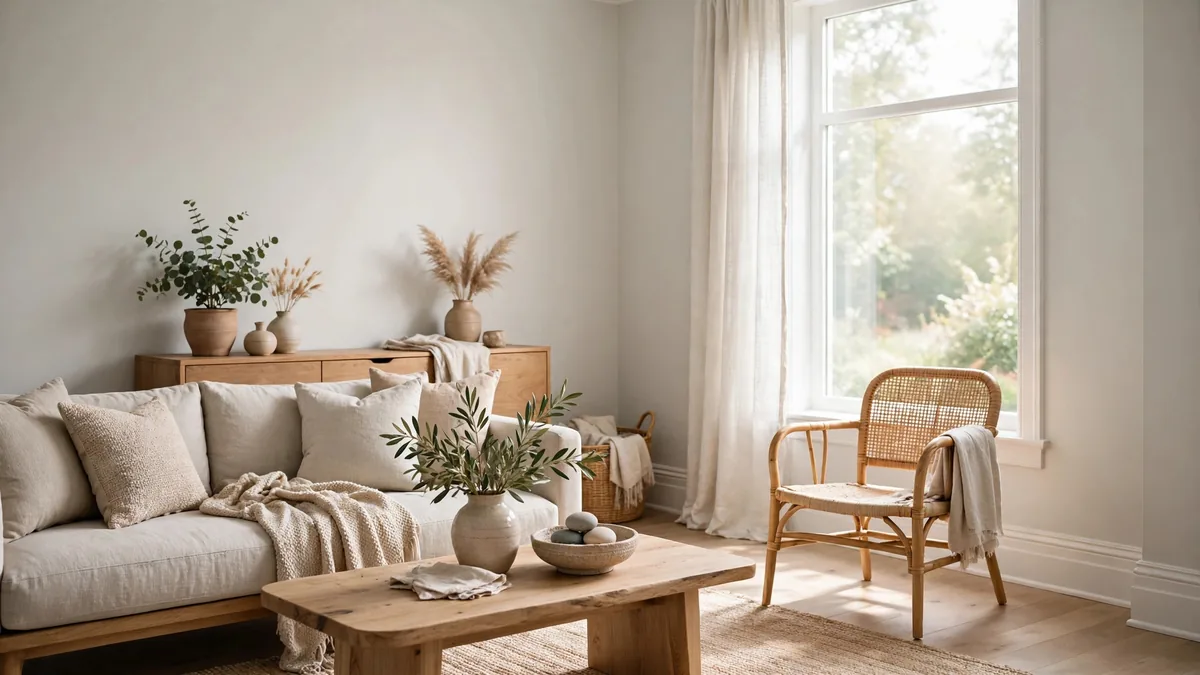
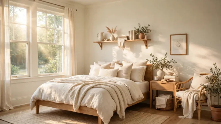
Drift of Mist Sherwin Williams SW 9166 is a light gray neutral that offers a softer alternative to stark white and deeper gray paint colors. It can create a calm, understated backdrop for living rooms, bedrooms, kitchens, and other interior spaces. However, its appearance depends on natural light, artificial lighting, and the colors surrounding it. Sherwin-Williams describes it as an airy, inviting gray and recommends viewing a physical sample before making a final color decision.
The main question is whether this shade will look gray, beige, or slightly green in your home. Understanding its light reflectance value (LRV), perceived undertones, coordinating colors, and differences from similar neutrals can help you make a more confident choice.
This guide explains the official color specifications, suitable color combinations, room-by-room applications, potential drawbacks, and practical ways to test Drift of Mist before painting.
What Is Drift of Mist Sherwin Williams?
Drift of Mist Sherwin Williams is a neutral paint color identified by Sherwin-Williams as SW 9166. The company featured it as its Color of the Month in February 2024, describing it as a soft, versatile gray that works with different room styles.
Its appeal comes from its restrained appearance. Rather than delivering the strong contrast of a dark gray or the crisp effect of a bright white, it occupies a lighter neutral range. This makes it worth considering for homeowners who want a subtle wall color that does not dominate their furniture, flooring, or decorative finishes.
Drift of Mist SW 9166 Color Specifications
The official Sherwin-Williams product record provides the following specifications.
| Specification | Details |
|---|---|
| Official color name | Drift of Mist |
| Sherwin-Williams color number | SW 9166 |
| Color family | Neutral, described by Sherwin-Williams as gray |
| Light Reflectance Value | 69.14 |
| RGB | 220, 216, 208 |
| Hexadecimal color code | #DCD8D0 |
| Product availability | Interior and exterior paint options are listed |
| Official coordinating colors | Eider White, Polished Concrete, Perle Noir |
These specifications help identify the intended color, but RGB and hexadecimal values represent digital color approximations. They cannot guarantee that a paint sample or finished wall will look identical on a screen. Sherwin-Williams specifically advises checking a physical color sample before purchasing paint.
What Does the LRV of 69.14 Mean?
Light Reflectance Value measures how much visible light a surface reflects. The scale runs from 0, representing black, to 100, representing white. Sherwin-Williams uses LRV as one factor in understanding how a paint color may appear under different lighting conditions.
With an official LRV of 69.14, Drift of Mist Sherwin Williams sits toward the lighter end of the color scale. It may help maintain a relatively bright appearance while providing more definition than a bright white.
However, LRV is not a measurement of how bright an entire room will feel. Window size, daylight exposure, artificial lighting, wall area, and surrounding surfaces all affect the perceived result.
Specification note: The HGTV Home by Sherwin-Williams listing for HGSW9166 reports an LRV of 62.0, while the SW 9166 product record reports 69.14. These pages use different product designations, and the available listings do not explain the discrepancy. For the paint discussed in this article, use the SW 9166 product information and verify the exact color number on the sample you purchase.
Is Drift of Mist Sherwin Williams Gray or Beige?
Drift of Mist is officially presented as a gray neutral. In a finished room, however, some people may perceive it as greige, which describes a blend of gray and beige characteristics.
The difference comes partly from the surrounding colors and light. Warm wood floors, beige upholstery, and creamy fabrics can make a neutral gray appear warmer. Cooler flooring, blue-toned daylight, and crisp white finishes may emphasize its gray appearance instead.
Some interior paint consultants describe Drift of Mist Sherwin Williams as a warm gray that can look cooler in north-facing light and more greige in sunnier rooms. These observations are useful design guidance, although they describe perceived color rather than a guarantee for every home.
When deciding whether the color fits your space, consider the following:
- Choose it if you want a light, understated gray neutral.
- Test it alongside beige or cream finishes if you prefer a warmer overall palette.
- Compare it with cooler gray paints if you want to minimize the appearance of warmth.
- Look at it beside your existing flooring and trim before deciding whether it reads too gray or too beige.
What Are the Undertones of Drift of Mist by Sherwin-Williams?
Undertones are the subtle color characteristics that become noticeable beneath a paint’s main appearance. A gray neutral may show hints of green, violet, blue, or beige depending on the paint and its surroundings.
Some professional paint reviews describe Drift of Mist as having a subtle green undertone, with its warmth becoming more or less noticeable under different lighting conditions. Sherwin-Williams itself emphasizes the color’s gray-neutral character and its ability to shift with the lighting in a space.
It is therefore more useful to assess how the paint behaves in your room than to rely on a single undertone label.
Warm Gray and Cool Gray Undertones
Warm gray undertones can create a softer relationship with wood, beige textiles, and other earthy finishes. Cool gray undertones can create a cleaner relationship with cooler whites, blue accents, and gray flooring.
Drift of Mist Sherwin Williams may appear warmer in some environments and cooler in others. This is why comparing gray and beige samples in the actual room is more informative than choosing a paint based only on its name.
For a reliable comparison, place your samples next to the fixed finishes in the room and observe them under both daylight and evening lighting.
How Does Lighting Affect Drift of Mist Sherwin Williams?
Lighting is one of the most important considerations when choosing a light neutral. Sherwin-Williams specifically notes that Drift of Mist can shift in character according to the lighting in the space.
North-Facing Rooms
North-facing rooms often receive less direct sunlight. A light gray may appear cooler or more subdued in these conditions, especially when the room also has cool flooring or blue-toned finishes.
If the sample looks colder than expected, compare it with a slightly warmer neutral before painting every wall.
South-Facing Rooms
Rooms with strong daylight may make Drift of Mist Sherwin Williams appear lighter and more open. The final effect still depends on window size, exterior obstructions, and the time of day.
In a very bright room, make sure the paint retains enough visible definition against white trim and ceilings.
East- and West-Facing Rooms
East-facing rooms experience changing morning light, while west-facing rooms can receive warmer afternoon light. Drift of Mist may appear different at these times even when the wall and paint remain unchanged.
Artificial Lighting
Light bulbs also affect perceived color. Warm lighting can make a gray neutral look creamier, while cooler lighting may emphasize a more muted gray appearance.
Before committing to the color, inspect the same sample in daylight and under the lighting you normally use in the evening.
What Colors Pair With Drift of Mist Sherwin Williams?
Sherwin-Williams provides two useful references for color coordination. The main SW 9166 product page lists Eider White, Polished Concrete, and Perle Noir. Its February 2024 Color of the Month palette lists Western Reserve, Quarry Stone, Prelude, Studio Beige, Skyline Steel, and Pure White. These are distinct manufacturer recommendations, rather than one combined definitive palette.
Beyond those official selections, several color combinations are worth testing based on the look you want to create.
1. Gray and White Color Combination
White is a versatile partner for light gray walls. It can create a clean, simple palette without requiring a bold accent color.
Sherwin-Williams Pure White SW 7005 is one option to sample. The manufacturer describes it as a versatile white with a slight yellow undertone, which can help it appear less stark than some brighter whites.
Use white for trim, doors, ceilings, or cabinetry. Check both colors side by side because two light neutrals may look more similar or more contrasting than expected.
2. Gray and Beige Color Combination
Beige introduces warmth and can keep a gray-based room from feeling overly cool.
Consider beige upholstery, natural linen, warm rugs, or wood furniture before adding another paint color. Sherwin-Williams’ official February 2024 coordinating palette includes Studio Beige SW 9602, which is a useful starting point for a warmer neutral scheme.
The goal is to balance the gray wall color with warmer materials, not necessarily to make every surface match.
3. Gray and Navy Blue Color Combination
Navy blue creates stronger contrast against a light gray neutral. It can work through accent chairs, cushions, bedding, artwork, or a smaller painted surface.
This combination is useful when you want a neutral backdrop with a more defined visual anchor. Balance dark blue with lighter textiles and wood finishes if the room already contains several dark elements.
4. Gray and Sage Green Color Combination
Sage green and muted botanical shades can support a relaxed, nature-inspired palette. Try sage in cushions, ceramic accessories, artwork, or selected cabinetry.
Because some paint reviewers observe a green tendency in Drift of Mist Sherwin Williams, test sage accents with a physical wall sample first. The combination may look harmonious in one space and too green or muddy in another.
5. Gray and Blush Pink Color Combination
Blush pink adds a soft, warm accent without the strong contrast of a saturated red or orange.
Consider blush cushions, bedding, curtains, or decorative objects. Keep the shade muted if you want a restrained neutral palette, or use a stronger pink accent when you want it to stand out.
6. Gray and Wood Tones
Natural wood is worth considering when you want more warmth and texture. Oak, walnut, and other wood finishes can create different effects depending on their depth and undertones.
For kitchens, compare Drift of Mist with the actual cabinet finish, countertop, and backsplash. In living rooms and bedrooms, use flooring and larger wooden furniture as the reference points.
7. Gray Color Palette and the Color Wheel
A simple color wheel can help organize a palette:
- Neutrals: White, beige, and other grays create a restrained scheme.
- Cool accents: Blue and blue-green shades give the palette a cooler direction.
- Warm accents: Blush, terracotta, and muted orange add warmth.
- Natural accents: Sage and wood tones introduce botanical or earthy qualities.
These are design options, not official paint-match guarantees. Start with the room’s existing materials, then select accent colors that create the contrast and mood you want.
What Colors Complement Gray Walls in a Living Room?
For living rooms, Drift of Mist Sherwin Williams can be paired with white trim, wood furniture, beige upholstery, navy accents, or muted greens. The right combination depends on the room’s lighting, floor color, furniture, and preferred style.
| Desired appearance | Colors and materials to consider | Where to use them |
|---|---|---|
| Light and understated | White, ivory, soft beige | Trim, curtains, rugs |
| Warm and natural | Oak, walnut, tan, linen | Furniture, flooring, upholstery |
| Stronger contrast | Navy, charcoal, deep blue | Accent chairs, cushions, artwork |
| Soft and botanical | Sage, muted green | Plants, textiles, decorative accessories |
| Gentle and warm | Blush pink, dusty rose | Throws, pillows, bedding |
| Coordinated neutral | Gray, greige, beige | Rugs, upholstery, nearby painted surfaces |
For a balanced result, start with one dominant neutral, one supporting material such as wood, and one accent color. Additional colors can be introduced through artwork and small accessories rather than competing across every surface.
Where Can You Use Drift of Mist Sherwin Williams in Your Home?
Drift of Mist in Living Rooms
The color can be considered for living room walls when you want a light neutral backdrop for furniture and artwork. It may work particularly well with natural wood, soft white trim, and fabrics that introduce texture.
Test it behind the sofa or near a large window. These locations help you see how the paint looks beside substantial furnishings and changing daylight.
Drift of Mist Sherwin Williams in Bedrooms
A light neutral may suit bedrooms where you want the walls to remain visually quiet. Beige bedding, white linens, muted green accents, and natural wood can all be starting points for a coordinated scheme.
Evaluate the sample under the bedside lamps as well as daylight, since those lighting conditions can change the way the gray appears.
Drift of Mist on Kitchen Cabinets
Drift of Mist Sherwin Williams is worth testing on cabinets when you want something softer than stark white. Before committing, compare it with the countertop, backsplash, floor, hardware, and other fixed materials.
A cabinet sample should be large enough to assess beside these surfaces. Small digital images may not reveal whether the gray looks too cool, too warm, or too similar to the countertop.
Drift of Mist Sherwin Williams in Bathrooms
In a bathroom, tile, mirrors, vanity finishes, and artificial lighting can influence the color’s appearance. Test the paint next to the tile and vanity before using it across the entire space.
Drift of Mist for Exterior Use
The official Sherwin-Williams record lists interior and exterior paint options for SW 9166. However, exterior light conditions differ from those indoors, so do not assume that a sample will look the same outside.
View an exterior sample under the daylight conditions where it will be used and alongside roofing, siding, brick, or stone. Also confirm that the specific product and finish you purchase are appropriate for the intended surface.
When Not to Use Drift of Mist Sherwin Williams
Drift of Mist Sherwin Williams may not be the right choice for every space. Its suitability depends on the look you want and how the color interacts with your room.
Consider another shade if:
- You want a distinctly warm beige. Drift of Mist is officially described as gray, so a more clearly beige neutral may be a better starting point.
- You want a deep, dramatic wall color. Its high official LRV places it toward the lighter end of the scale. A deeper gray or a saturated color may better suit that preference.
- Your existing finishes clash with the sample. If the paint appears unexpectedly green, cool, or muddy beside your flooring and cabinetry, test alternatives before proceeding.
- You want a very crisp contrast against white trim. Some light neutrals can sit close to white visually. Compare the finished samples in your actual lighting to decide whether the difference is sufficient.
- You need a predictable exterior appearance. Strong outdoor light can change how a light neutral is perceived. Test it outside rather than relying on interior photographs.
These are reasons to test alternatives, not proof that the paint will fail in a particular room. A physical sample provides a much better basis for a decision than a general rule about lighting or color undertones.
Drift of Mist vs. Similar Sherwin-Williams Colors
Comparing similar shades helps clarify whether Drift of Mist Sherwin Williams is the right depth and character for your project.
The table below uses LRV values from Sherwin-Williams product records. Because different product lines may report different measurements, verify the exact product designation before using numbers from multiple listings.
| Paint color | Color number | Official LRV | General comparison |
|---|---|---|---|
| Drift of Mist | SW 9166 | 69.14 | Light gray neutral |
| Gossamer Veil | SW 9165 | 61.829 | Lower LRV, with a deeper appearance |
| Agreeable Gray | SW 7029 | 60.386 | Lower LRV than Drift of Mist |
| Repose Gray | SW 7015 | 58.22 | Lower LRV and a deeper gray appearance |
Drift of Mist vs. Gossamer Veil
Gossamer Veil has a lower official LRV than Drift of Mist Sherwin Williams, indicating a difference in light reflectance. Sherwin-Williams describes Gossamer Veil as a cool, mist-gray neutral.
Compare the samples if you want a similar neutral with a little more depth.
Drift of Mist Sherwin Williams vs. Agreeable Gray
Agreeable Gray has a lower official LRV of 60.386 compared with Drift of Mist’s 69.14. That makes LRV a useful starting point when evaluating the relative lightness of the two colors.
Choose between them by observing the samples beside your fixed finishes rather than assuming that a lower LRV alone determines which color will suit the room.
Drift of Mist vs. Repose Gray
Repose Gray has an official LRV of 58.22, lower than Drift of Mist’s 69.14. It is therefore a useful comparison if you are considering a deeper-looking neutral.
Look at both samples from across the room and at different times of day. The color that works best will depend on the amount of contrast and warmth you prefer.
How to Test Drift of Mist Sherwin Williams Before Painting
A sample test is one of the most useful steps in selecting paint. It allows you to evaluate the actual product in the room rather than relying entirely on online photographs.
- Get a physical sample. Use the official SW 9166 color reference and confirm the product designation before purchasing.
- Test more than one location. Place the sample on different walls or test surfaces, including areas with different daylight exposure.
- Compare surrounding finishes. View it beside trim, flooring, cabinetry, countertops, or the largest furnishings in the room.
- Check it at different times. Observe the sample in morning light, afternoon light, and under your normal evening lighting.
- Compare your alternatives together. Place samples of Drift of Mist, Gossamer Veil, Agreeable Gray, or another candidate side by side.
- Make the decision after viewing the samples in context. Check whether the color provides the desired contrast and whether any green, beige, or cool qualities are noticeable beside your finishes.
Sherwin-Williams offers color chips, peel-and-stick samples, and paint samples for evaluating its colors. Its official product page also cautions that actual paint may vary from its on-screen representation.
Final Verdict:
Drift of Mist Sherwin Williams SW 9166 is worth considering if you want a light gray neutral that provides a softer alternative to stark white. Its official LRV places it toward the lighter end of the scale, while its perceived warmth and undertones can vary with lighting and surrounding finishes.
Its success depends less on its popularity or how it looks in a staged photograph and more on how it works with your own room. Compare it with your trim, flooring, cabinets, and preferred accent colors, then observe the samples under the lighting you actually use.
Frequently Asked Questions About Drift of Mist Sherwin-Williams
Is Drift of Mist gray or beige?
Drift of Mist Sherwin Williams SW 9166 is officially described by Sherwin-Williams as a gray neutral. Some homeowners and designers may perceive it as greige in certain rooms, depending on the lighting and surrounding colors.
What are the undertones of Drift of Mist by Sherwin-Williams?
Some independent paint reviews describe a subtle green undertone and note that the color can appear cooler in certain lighting conditions. These are observations of its perceived appearance, so test the actual paint beside your existing finishes.
What is the LRV of Drift of Mist Sherwin Williams SW 9166?
The official Sherwin-Williams SW 9166 product record lists an LRV of 69.14. The separate HGSW9166 listing reports 62.0, so make sure you are checking the exact product designation when comparing specifications.
What colors pair with Drift of Mist?
The official SW 9166 product page lists Eider White SW 7014, Polished Concrete SW 9167, and Perle Noir SW 9154 as coordinating colors. White, beige, navy, sage green, blush pink, and natural wood tones are additional design directions to test in your room.
When should you avoid Drift of Mist Sherwin Williams?
Consider another color if you want a strongly beige or dark gray appearance, need more contrast than the sample provides, or find that its perceived undertones clash with your finishes. The right choice depends on your room, lighting, and preferred palette.
Is Drift of Mist Sherwin Williams suitable for an entire house?
It can be considered for connected spaces where a consistent light neutral is desirable. Before using it throughout a home, sample it in rooms with different window exposures and check it against the fixed finishes in each space.
Can Drift of Mist be used on kitchen cabinets?
It is worth testing on kitchen cabinetry if you want a light neutral rather than a bright white. Check the sample against the countertop, backsplash, flooring, hardware, and wall paint before committing.
Is Drift of Mist Sherwin Williams suitable for exterior paint?
Sherwin-Williams lists interior and exterior options for SW 9166, but the specific product and finish should match the intended surface. Test the color outside because the light conditions may produce a different visual result from an interior sample.