Pearly White Sherwin Williams (SW 7009): Color Review, LRV, and Best Pairings

Pearly White Sherwin Williams (SW 7009) is a soft, warm white with a light reflectance value (LRV) of 77 and a HEX code of #E8E3D9. It sits between a creamy white and a pale neutral, so it works on walls, cabinets, trim, and exteriors.
If you are comparing pearly white sherwin williams with brighter or creamier whites, this guide covers the verified color data, how it changes in different light, what to pair it with, and where it works best.
What color is Sherwin Williams Pearly White?
Sherwin Williams Pearly White is a soft off-white paint color. Sherwin-Williams lists it in the White & Pastel family and in its Designer Color Collection, and it is approved for both interior and exterior projects.
In plain terms, Pearly White Sherwin Williams is the kind of white that feels clean without feeling cold. It reads lighter than beige and warmer than a crisp builder white.
| Detail | Pearly White |
|---|---|
| Color name and code | Pearly White, SW 7009 |
| Color family | White & Pastel (Designer Color Collection) |
| HEX code | #E8E3D9 |
| RGB values | 232, 227, 217 |
| Light Reflectance Value (LRV) | 77 |
| Use | Interior and exterior |
| Coordinating colors listed by Sherwin-Williams | Jogging Path (SW 7638) and Grapy (SW 7629) |
The HEX and RGB values are useful for mockups and design software. They will not match your wall exactly, because screens and sheen change how paint looks.
Is Pearly White Sherwin Williams warm or cool?
Pearly White is a warm white. Sherwin-Williams does not print an undertone label on the color page, but the numbers point the same way. The RGB values (232, 227, 217) have more red than blue, which is the signature of a warm neutral.
Designers and cabinet makers commonly describe it as a soft warm white with a subtle greige cast. That gray softener keeps it from looking yellow or creamy.
Paint undertones you will actually see
On a small chip it looks like a plain soft white. On a wall, you tend to notice three things:
- Greige: the main softener, which keeps the white calm and slightly muted.
- Beige: a faint warmth that shows up in afternoon sun and warm bulbs.
- Cream: only a hint, which is why it stays cleaner than a true cream.
The practical takeaway is to treat pearly white sherwin williams as a flexible, quiet white. Pair it with warm materials and it feels cozy. Pair it with icy blues and the warmth becomes more obvious.
What is the LRV of Pearly White?
The Light Reflectance Value (LRV) of pearly white sherwin williams is 77. LRV runs from 0 (absorbs all light) to 100 (reflects all light), so 77 puts this color in the light range. It reflects most of the light that hits it.
That has real effects in a room:
- It brightens smaller or darker rooms. A high LRV helps a kitchen or hallway with limited daylight feel more open.
- It is softer than a bright white. Compared with brilliant whites in the mid 80s, it feels calmer and less glaring.
- It can look flat in very dim rooms. Without good lighting, any off-white can feel dull, so layered lamps help.
For context, Sherwin-Williams lists Alabaster at LRV 82 and Pure White at LRV 84. That makes Pearly White the softer, slightly deeper option of the three.
How lighting conditions change Pearly White
Lighting is the biggest reason two people describe sherwin williams pearly white differently. Natural light direction, bulb temperature, and sheen all move the color.

| Room exposure | What to expect |
|---|---|
| North-facing | Quieter and more neutral, with the greige side showing more |
| South-facing | Warmer and creamier, but still clean rather than yellow |
| East-facing | Soft and bright in the morning, a little warmer later in the day |
| West-facing | Warmer and more golden in the afternoon and evening |
Bulbs matter too. Neutral to slightly warm bulbs keep the color balanced. Very cool LED bulbs can pull it toward gray, so keep the bulb temperature consistent across a room.
Sheen plays a part as well. A satin or semi-gloss finish reflects more light and looks slightly brighter, while a flat finish looks softer and more velvety.
Is Pearly White darker than Alabaster and Pure White?
Yes. Pearly White has an LRV of 77, Alabaster is 82, and Pure White is 84, so Pearly White is the deepest of the three. It is also warmer and more muted than Pure White.
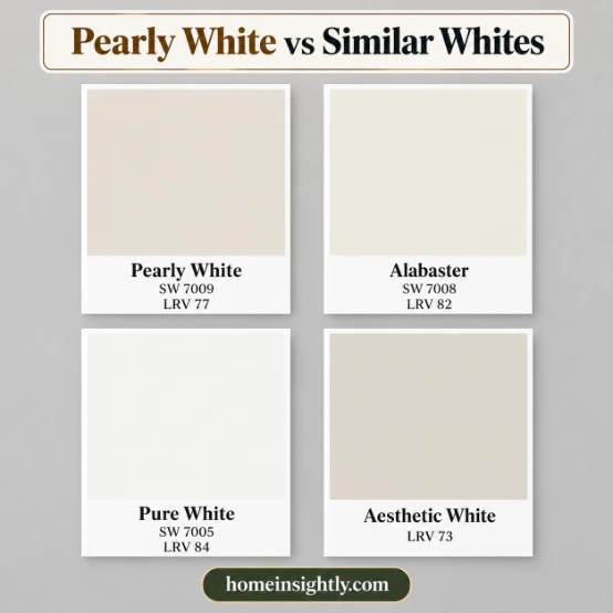
| White | LRV | How it differs from Pearly White |
|---|---|---|
| Pearly White SW 7009 | 77 | Baseline, a soft warm white with a greige cast |
| Alabaster SW 7008 | 82 | Creamier and brighter, with a richer warm feel |
| Pure White SW 7005 | 84 | Cleaner and crisper, with less beige softness |
The differences are small on a chip and larger on a wall, so sample Pearly White Sherwin Williams beside the others.
Pearly White vs similar white paint colors
If you are not sure pearly white sherwin williams is the right white, sample it beside these neighbors.
Pearly White vs Alabaster
Alabaster is brighter and creamier. It suits traditional rooms and homes with lots of warm wood. Choose Pearly White if you want less yellow and a softer, more neutral look.
Pearly White vs Pure White
Pure White is the cleaner choice with crisper edges. Pearly White gives a softer, more lived-in feel, which many people prefer on cabinets and large walls.
Pearly White vs Eider White and Neutral Ground
Eider White (LRV 73) is a lighter greige that leans more gray. Neutral Ground (LRV 70) is a deeper tan with more yellow in it. Pearly White sits between them in warmth and is the lightest of the three.
What color goes best with Pearly White?
Warm neutrals, natural wood, brushed metals, and earthy accents go best with pearly white sherwin williams. Crisp white trim, soft greens, and muted blues also work when you want contrast without harshness.
Sherwin-Williams lists two coordinating colors on its own page: Jogging Path (SW 7638) and Grapy (SW 7629).
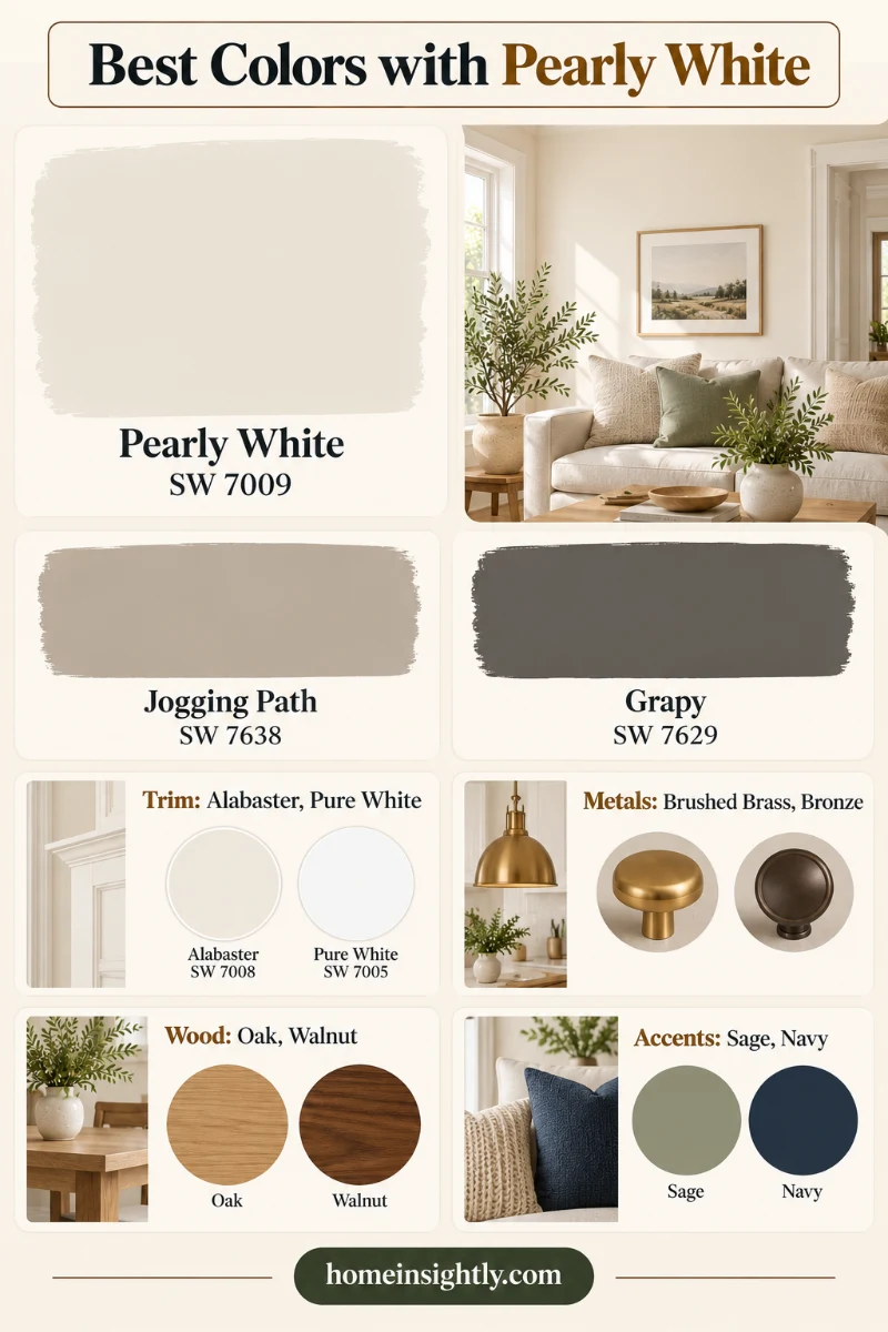
| Pairing type | Good options | Why it works |
|---|---|---|
| White trim | Pure White, Alabaster | Clean edges, or a softer cohesive look |
| Grounding neutrals | Accessible Beige, Agreeable Gray | Add depth while staying warm and calm |
| Official coordinating colors | Jogging Path, Grapy | Chosen by Sherwin-Williams to sit with this color |
| Accents | Sage green, dusty blue, terracotta | Muted colors that do not fight the warm base |
| Metals | Brushed nickel, soft polished nickel, muted brass | Add warmth or softness without glare |
| Natural materials | White oak, linen, stone, rattan | Echo the earthy base |
Best trim colors with Pearly White
You have two clean options. Pure White gives crisp contrast, while Alabaster gives a softer, more tonal look. If you want a monochrome feel, paint the trim in Pearly White itself in a semi-gloss finish. For a creamier option, Dover White Sherwin-Williams is worth a look.
Coordinating neutrals
Accessible Beige (SW 7036) adds a deeper, grounded look. Agreeable Gray (SW 7029) gives a cooler, calmer balance. Both pair naturally with a soft warm white. A soft gray such as Light French Gray also sits well beside it.
Metals and hardware
Brushed nickel and soft polished nickel keep things light and classic. Muted brass adds warmth. Very blue-toned chrome and heavily distressed dark metals tend to feel disconnected from this color.
Does Pearly White go with wood, countertops, and flooring?
Yes, with a few details to watch. This color is forgiving because its warm base accepts most natural materials.
| Finish | What works with Pearly White |
|---|---|
| White quartz with gray or taupe veining | Looks clean and balanced |
| Soft marble looks | Adds quiet contrast and a classic feel |
| Light or natural white oak floors | Echoes the warmth of the color |
| Medium woods with low orange tones | Add depth without clashing |
| Very yellow-beige granite | Can make the white look washed out |
| Red-toned woods | Can fight the soft base, so sample first |
| Very cool gray floors | Can make the warmth look dingy |
Interior paint applications: where Pearly White works best
Pearly White is a good fit anywhere you want brightness with some softness.

Kitchen cabinets
Pearly White Sherwin Williams suits farmhouse, transitional, traditional, and soft contemporary kitchens. Because the LRV is 77, it keeps a small or low-light kitchen feeling open.
Shaker, slim shaker, and slab doors all work. Use a satin or semi-gloss finish for durability and easy cleaning.
Living rooms and bedrooms
On walls, Pearly White Sherwin Williams creates a calm backdrop that lets art, textiles, and furniture do the talking. It pairs well with a layered scheme of linen, wood, and soft neutrals. A muted green accent such as Dried Thyme also looks calm beside it.
Bathrooms, mudrooms, and built-ins
Pearly White Sherwin Williams keeps bathrooms and mudrooms looking clean and bright. On built-ins and shelving, it frames decor without feeling stark.
Trim and ceilings
Using the same color on trim and walls gives a soft, enveloping look. For more definition, use a brighter white on the ceiling and trim.
Is Pearly White a good exterior paint color?
Sherwin-Williams lists Pearly White for interior and exterior use, so it can work outside. A large sample on the siding itself is essential, because strong daylight makes any white look lighter and brighter than the chip.
As a body color, it pairs well with deeper trim or a darker front door for contrast. Always buy it in an exterior-rated product, since an interior paint will not hold up to weather.
Exterior pairings: shutters, brick, and stone with Pearly White
Sherwin-Williams lists Pearly White for interior and exterior use. As a soft warm white it works as a siding color or as trim, and these pairings are common starting points.
| Exterior element | Pairing idea | Why it works |
|---|---|---|
| Shutters | Black, charcoal, deep green, or navy | Dark shutters give crisp contrast against a soft warm white |
| Red or brown brick | Pearly White as trim or accents | A warm white looks softer next to brick than a stark white |
| Stone | Warm gray or tan stone | The warm cast of Pearly White blends with natural stone |
| Front door | Deep green, navy, or a warm wood stain | Adds color while the walls stay neutral |
At LRV 77, Pearly White looks bright outdoors, so sunny walls can read closer to white and shaded walls creamier. Test a large sample in both.
Sheen, availability, and paint samples
The sheen you choose changes both the look and the upkeep of pearly white sherwin williams.
| Sheen | Best for | Notes |
|---|---|---|
| Flat | Ceilings, low-traffic walls | Softest look, but harder to wash |
| Eggshell or satin | Bedrooms, living rooms, bathrooms | Moderate traffic, wipeable |
| Semi-gloss | Cabinets, doors, trim, exteriors | Most durable and cleanable, adds glow |
| Gloss | Accents | Very durable, but shows surface flaws |
Where to buy it
You can buy SW 7009 at Sherwin-Williams stores and online. Check the exact product line and sheen before you buy, because the color is the same but the paint line decides durability and finish options.
How to test paint samples
Samples are the only reliable way to judge a white, because screens do not show undertones accurately.
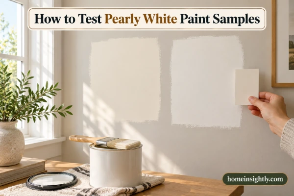
- Get a sample of Pearly White and one or two close whites such as Alabaster and Pure White.
- Paint large patches on at least two walls, including one that gets little direct light.
- Check them in the morning, afternoon, and evening, and again under your actual bulbs.
- Hold them beside your trim, flooring, cabinets, and fabrics.
- Wait until the sample is fully dry before judging it, because paint can shift as it cures.
Who will love Pearly White, and when to skip it
Pearly White Sherwin Williams is a good fit for people who want a soft, warm white that feels clean but not clinical.
| Pros | Cons |
|---|---|
| Soft and warm without looking yellow | Can look dull in very dim rooms |
| Works with wood, brass, and natural stone | Warmth shows against icy blue or cool gray |
| High LRV of 77 keeps rooms bright | Less crisp than a true bright white |
| Approved for interior and exterior use | Needs sampling beside your trim and flooring |
When to skip it
- Ultra-modern, cool palettes: a crisper white such as Pure White may suit them better.
- Rooms with strong yellow-toned finishes: the white can look washed out beside them.
- Homes where you want a very cream, cozy look: Alabaster is warmer.
How does Pearly White compare with Aesthetic White, White Duck and Creamy?
| Color | LRV | How it differs |
|---|---|---|
| Pearly White (SW 7009) | 77 | Creamy base with a lot of gray |
| Aesthetic White | 73 | A little deeper and softer |
| White Duck | 74 | A deeper warm white |
| Creamy | 81 | Brighter and creamier |
A mid-level LRV like 77 is why this color can look dingy in a dark room and wash out in a very bright one. It does best in rooms with average light.
What is the Benjamin Moore or Behr equivalent of Pearly White?
No other brand offers an exact twin of pearly white Sherwin Williams, but a few close matches come up in color-comparison tools.
| Brand | Closest match | How it compares |
|---|---|---|
| Benjamin Moore | Seapearl (961) | Very close in lightness at about LRV 76, with a warm yellow tone |
| Benjamin Moore | Etiquette (AF-50) | Another close option when matching by HEX value |
| Behr | Weathered White (HDC-NT-21) | About LRV 76.5 with a warm, yellow undertone |
No paint brand publishes official cross-brand equivalents. These matches come from color-comparison tools that line up HEX values and LRV, so treat them as starting points and always check a physical sample in the brand you plan to buy.
Quick decision guide: is Pearly White right for your room?
| Your situation | Verdict | Why |
|---|---|---|
| Small or low-light kitchen | Yes | An LRV of 77 keeps the room open without glare |
| Lots of warm wood or brass | Yes | The warm base accepts natural materials |
| Cool, modern palette with chrome and gray | Test first | The warmth can show beside icy tones |
| You want a crisp, bright white | Skip | Pure White (LRV 84) is cleaner and brighter |
| Large sunny exterior | Test first | Strong daylight makes any white look lighter, so test on the siding |
Common mistakes with Pearly White
- Choosing the trim last. Pick the trim white first, because Pearly White looks different beside Pure White than beside Alabaster.
- Mixing bulb temperatures. Cool and warm bulbs in one room make the same wall look like two colors.
- Judging a wet sample. Wait until the patch dries before deciding.
Final verdict: is Pearly White the right white?
Choose pearly white sherwin williams if you want a soft, warm white with a gentle greige cast, an LRV of 77, and enough flexibility for cabinets, walls, trim, and exteriors. Choose Alabaster if you want more cream, and Pure White if you want a crisper, brighter look.
Whichever way you lean, sample it in your own light before you buy. A large test patch is the cheapest way to avoid repainting.
FAQs about pearly white sherwin williams
Is Pearly White a warm or cool white?
It is a warm white with a subtle greige cast. The RGB values have more red than blue, and the gray softener keeps it from turning yellow.
What is the HEX code for Pearly White?
The HEX code is #E8E3D9 and the RGB values are 232, 227, 217. Use them for digital mockups and confirm with a physical sample.
What is the LRV of Sherwin Williams Pearly White?
The LRV is 77, which places it in the light range. It is slightly deeper than Alabaster (82) and Pure White (84).
Is Pearly White a good kitchen cabinet color?
Yes, especially in farmhouse, transitional, and soft contemporary kitchens. It pairs well with white quartz, brushed nickel or muted brass, and natural wood. Choose a satin or semi-gloss finish.
Can you use Pearly White on a home exterior?
Yes. Sherwin-Williams lists it for interior and exterior projects. Use an exterior-rated paint and test a large sample on the siding.
What white trim goes with Pearly White?
Pure White gives crisp contrast and Alabaster gives a softer, more tonal look. Sample both beside your walls.
Is Pearly White the same as Alabaster?
No. Alabaster has an LRV of 82 and looks creamier and brighter. Sherwin Williams Pearly White is softer, slightly deeper, and more neutral.