Benjamin Moore Edgecomb Gray HC-173: The Warm Greige That Works Almost Everywhere
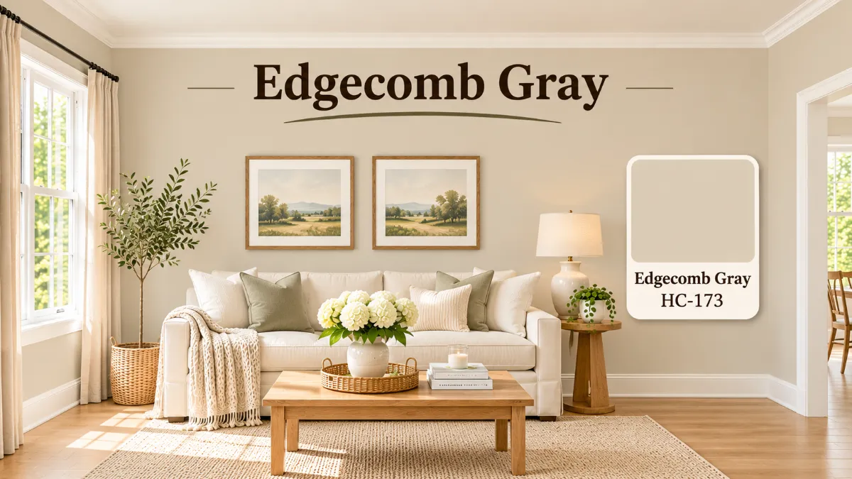
Quick answer: Benjamin Moore Edgecomb Gray HC-173 is a light, warm greige with an LRV of 63.09. It leans beige more than gray, with faint green and pink undertones that keep it soft instead of yellow. It looks calm in most rooms, pairs well with creamy whites like White Dove, and is a safe pick for a whole house color, as long as you test it in your own light first.
If you have ever stood in front of a wall of beige and gray chips and felt stuck, you are not alone. Most “greige” colors lean too pink, too green, or too cold once they are on the wall. This one is popular because it sits in the middle. It feels warm without looking like a tan sweater, and it feels neutral without turning chilly.
This guide explains what the color really looks like, how light changes it, what to pair it with, and when to skip it. Read to the end for the room-by-room advice, the sampling plan and ten quick answers, so you can pick with confidence and avoid repainting. Every number below comes from Benjamin Moore’s own color pages. Where a Sherwin-Williams number could not be confirmed, it is left out on purpose.
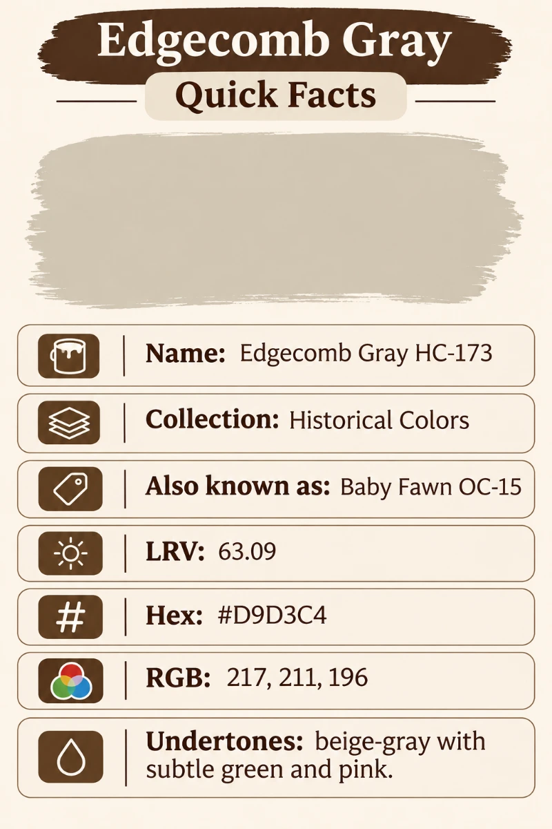
Quick Facts
| Detail | Value |
|---|---|
| Brand | Benjamin Moore |
| Color name and number | HC-173 |
| Collection | Historical Colors Collection |
| Also known as | Baby Fawn OC-15 (the same color in the Off-White Collection) |
| LRV | 63.09 |
| Hex code | #D9D3C4 |
| RGB | 217, 211, 196 |
| Color family | Greige (warm neutral) |
| Undertones | Beige-gray with subtle green and pink |
Light Reflectance Value, or LRV, is a score from 0 (black) to 100 (pure white). A score of 63.09 puts this paint in the light range, but not so light that it vanishes. It reflects enough light to brighten a room and still shows clear color on the wall.
Who This Color Is For
This paint suits you if you want a neutral that feels lived in and gentle. It works well for people who like cream trim, wood cabinets, warm metals and natural fabrics. It is also a good fit if your house has mixed finishes, such as oak floors in one room and tile in another, because it does not fight with either.
It is less suited to people who want a crisp, cool, modern gray. If you picture a light silver wall with black window frames, a cooler gray will get you closer.
What Color Is It? Edgecomb Gray Warm Greige Explained
In plain words, it is a pale warm gray with a lot of beige in it. On a swatch, many people call it a soft stone or a light putty. Indoors, it often looks like a creamy gray-beige. In bright daylight it can look a touch lighter, and in a dim room it settles into a quiet mushroom shade. Some designers also describe it as a light taupe, a close cousin of greige.
Greige means a mix of gray and beige, and here the beige leads while the gray keeps the color from feeling sweet or sandy. Put it beside a true gray and you will see the warmth right away. Put it beside a yellow-based cream and you will see the gray in it.
A simple test helps. Hold a white sheet of paper next to your sample. If the paint looks slightly creamy and soft, you are seeing the beige. If it looks a bit dull or stony, you are seeing the gray. Most people see both, which is exactly what makes a greige useful.
Edgecomb Gray Undertones: What You Will Actually See
Benjamin Moore does not publish undertone names, so the notes here come from how the color behaves on real walls and from the consensus of designers and painters who use it. Treat them as a guide and trust your own sample.
- Beige-gray base: the main character. This keeps the color warm.
- Subtle green: shows up in cool north light or next to green plants and tile. It reads as a soft sage hint, never a bold green.
- Subtle pink: shows up in warm evening light or beside pink-toned wood. It adds a gentle blush, not a rosy wall.
Because the undertones are mild, the color rarely turns obviously green or pink. That is a big reason it is trusted as a whole house color.
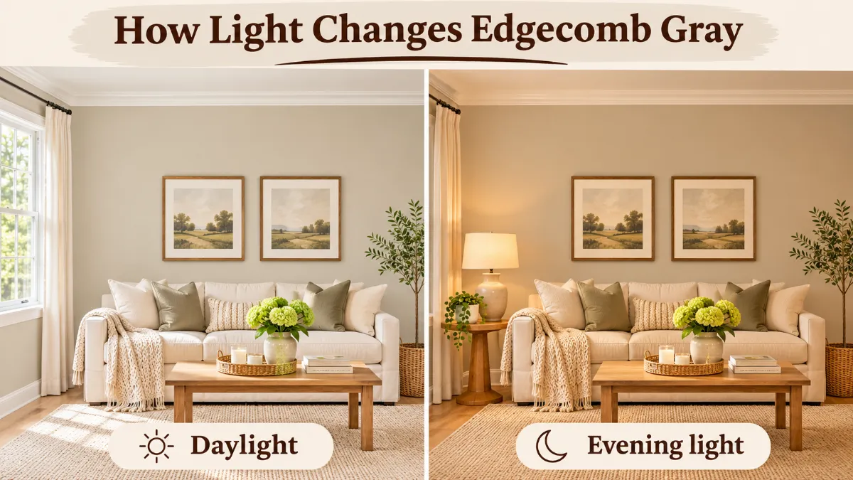
How Light Changes the Color
Light is the biggest factor in how any paint looks. The same color can look like two different paints in two rooms.
| Room light | What to expect |
|---|---|
| North-facing rooms | Cooler light. The color looks grayer, with a hint of green. It can feel a bit flat on gloomy days. |
| South-facing rooms | Warm, bright light. The color looks creamier and lighter, with the beige leading. |
| East-facing rooms | Warm in the morning, cooler later. It shifts from soft cream to quiet gray. |
| West-facing rooms | Cool in the morning, warm gold in the evening. Expect a peachy glow at sunset. |
| Artificial light | Warm bulbs push it toward beige. Cool white bulbs pull it toward gray. |
If your room faces north and you want more warmth, choose warm white bulbs and add wood, brass or woven textures. If your room faces south and you want it a little cooler, pick a cooler white for the ceiling and trim.
Edgecomb Gray LRV 63.09: Why It Matters
An LRV near 63 means the color reflects a bit more than half of the light that hits it. In practice, that means:
- Rooms feel brighter than with darker greiges like Revere Pewter.
- Small rooms still feel open, but you will not get the airy glow of an off-white.
- Wall color looks fairly steady from morning to night, with no big jumps.
Higher LRV paints make small, dim spaces feel larger. Lower LRV paints feel cozier. Because this one sits in the middle, it works as a balanced choice for both.
Edgecomb Gray Baby Fawn OC-15: The Same Color, Two Names
Benjamin Moore sells this color in two collections. In the Historical Colors Collection it is HC-173. In the Off-White Collection it is Baby Fawn OC-15. The color is the same, so you can use either name when you shop or when you read reviews.
If you see someone say that Baby Fawn looks different, they are most likely describing a different room, different light or a different finish. Always ask your paint store to confirm the code before they mix.
The Best Trim Colors for This Greige
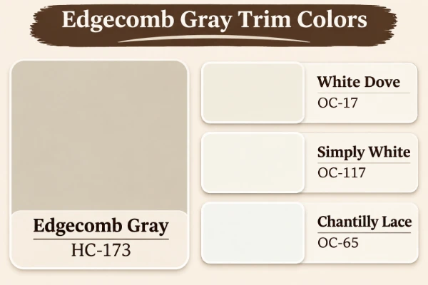
Trim should be clean and a little brighter than the wall. These whites work best because they share its warm leaning.
| Trim color | Code | LRV | Hex | Why it works |
|---|---|---|---|---|
| White Dove | OC-17 | 83.16 | #EFEEE5 | Soft, creamy and warm. The most popular pairing, and the safest choice. |
| Simply White | OC-117 | 89.52 | #F6F6ED | Brighter and a little cleaner. Good if you want more contrast. |
| Chantilly Lace | OC-65 | 90.04 | #F4F6F1 | Crisp and clean. Gives a sharp, modern outline. |
For a classic look, go with White Dove. If your home has cream trim already, you can keep it. This color looks very good next to aged cream because both have warm bases. If you want a clear contrast for crown molding and baseboards, Chantilly Lace gives the cleanest edge.
Coordinating Colors
Coordinating colors share the same warm or neutral base, so they blend without drama. Good options from Benjamin Moore include:
- White Heron OC-57: a soft white for ceilings, doors or built-ins.
- Pashmina AF-100: a deeper greige for an accent wall, a mantel or a front door in a sheltered porch.
- Dove Wing OC-18: a slightly lighter, airy neutral for adjoining rooms.
- Boothbay Gray HC-165: a soft blue-gray for bedrooms or bathrooms.
Use these when you want a whole home palette that flows. Keep the undertones similar and change only the depth.
Complementary Colors
Complementary colors sit opposite the wall color on the color wheel and make it look richer. Because this paint is a warm neutral with a hint of yellow-green, the natural partners are muted blues and deeper blue-greens.
- Dusty navy or slate blue for a sofa, a rug or a cabinet.
- Deep teal or forest green for pillows, plants and art.
- Soft terracotta and rust for a warm, earthy contrast.
- Charcoal and warm black for frames, lighting and hardware.
Use these in small to medium amounts. Let the wall stay quiet and let the accents do the talking.
Popular Color Palettes
Here are three easy palettes that designers often reach for.
| Palette | Walls | Trim | Accents |
|---|---|---|---|
| Classic cozy | HC-173 | White Dove | Warm brass, oatmeal linen, oak wood |
| Soft coastal | HC-173 | Simply White | Muted blue, sandy rope, weathered wood |
| Modern earthy | HC-173 | Chantilly Lace | Forest green, black metal, terracotta |
A Whole House Color That Holds Together
Many people choose this shade as a whole house color because the light level is steady and the undertones are mild. When you use one color throughout, you get a calm flow from room to room, and you can vary the feel with trim, textiles and lighting.
A few tips make it work better:
- Paint the main living spaces first, then check how it looks in hallways.
- Use the same trim white everywhere for a clean, connected look.
- Switch to a lighter ceiling white so the walls do not feel heavy.
- Add depth with one or two deeper accent colors, not many.
Room by Room
Living room. This is where the color shines. It makes sofas, rugs and wood tables look warm and inviting. In a living room with large windows, it looks soft by day and cozy by night. Pair it with cream upholstery, natural wood and a few darker accents.
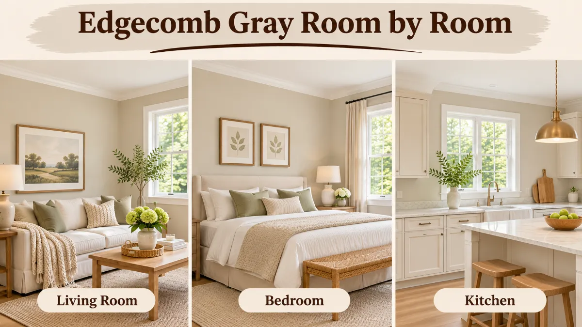
Bedroom. The mild undertones make it restful. Choose a matte or eggshell finish to keep the surface calm. Layer with linen bedding, warm lamps and a wood headboard. If your bedroom faces north, add warm bulbs so it does not feel cold.
Bathroom. It looks clean with white tile, brushed nickel or brass fixtures and a wood vanity. Use a satin or semi-gloss finish for moisture control. Check how it looks beside your tile, since green-gray tile can make the undertones look greener.
Kitchen cabinets. It works as a soft, neutral cabinet color, especially with white counters and warm hardware. A satin or semi-gloss cabinet paint gives it a clean finish and holds up to daily use. For a lighter feel, paint the cabinets and keep the walls a creamy white.
Exterior. On the outside, light changes the color a lot. In full sun it looks lighter and creamier, and in shade it looks grayer. It suits siding, stucco and trim on traditional or cottage homes. Test a large patch on the wall, because a small chip will mislead you outdoors.
Flooring That Looks Good With It
The right floor makes this color look intentional. These are the most common pairings:
- Light and medium oak: warm and natural. A safe match.
- Dark wood flooring: adds contrast and makes the walls feel lighter.
- Gray-toned laminate or vinyl: works if the gray is warm. Avoid very cool blue-gray floors.
- Stone and tile: beige or cream tile looks seamless. Cool white tile looks crisp.
- Wool and jute rugs: add texture and keep the room from feeling flat.
If your floors have strong red or orange tones, test carefully. Red-toned wood can pull out the pink in the paint.
Finding a Lighter Version of Edgecomb Gray
If the color feels a bit heavy for your room, you have two good ways to lighten it.
| Option | Code | LRV | Notes |
|---|---|---|---|
| Balboa Mist | OC-27 | 65.53 | A close, slightly lighter cousin. Very subtle step. |
| Pale Oak | OC-20 | 68.64 | Lighter and a touch creamier. |
| Winds Breath | OC-24 | 69.59 | Airy and soft with a gentle gray lean. |
You can also ask your paint store to mix the same formula at 25 to 50 percent strength. This keeps the exact undertone but lowers the depth. Always sample it before you commit, since a lighter mix can look more green or more pink than the full strength color.
Choosing the Right Finish
Finish changes how the color feels almost as much as light does.
- Flat or matte: hides bumps and gives the softest, most velvety look. Best for ceilings and low-traffic walls.
- Eggshell: a gentle sheen that wipes clean. The best all-around choice for living rooms and bedrooms.
- Satin: a bit more shine and easier to scrub. Good for hallways, kids’ rooms and kitchens.
- Semi-gloss: hard and durable. Use it on trim, doors and cabinets.
A glossier finish reflects more light, so the same color can look slightly lighter and a little cooler as the sheen goes up. If you are unsure, start with eggshell on the walls and semi-gloss on the trim, then adjust once you see how the room feels in daily use. Two coats give the most even, true look, and a quick light sanding between coats helps cabinets feel smooth.
Common Mistakes to Avoid
- Judging the color from a tiny chip under store lights.
- Painting the trim last without testing it beside the wall.
- Skipping primer over a dark or patchy wall, which can change the final shade.
- Ignoring bulbs. A warm bulb and a daylight bulb can make this paint look like two colors.
- Choosing a white trim with a cold blue base, which makes the wall look dingy by comparison.
Comparisons: How It Differs from Popular Neutrals
vs Revere Pewter
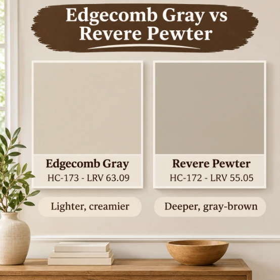
Revere Pewter HC-172 has an LRV of 55.05, so it is deeper and heavier. It reads as a richer, more gray-brown shade. The color in this guide is lighter and creamier. Choose Revere Pewter for cozy, moody spaces. Choose the lighter one when you want a bright, soft room.
vs Pale Oak
Pale Oak OC-20 is lighter at 68.64 and leans slightly pink. It feels airier. If your room is small or dim, it may be a better fit. If you want more body and a more obvious greige, stay with this one.
vs Agreeable Gray
Agreeable Gray SW 7029 is the Sherwin-Williams neutral most often compared with this color. It is a gray-leaning greige and usually looks a little grayer, with less beige showing. It is a good choice if you want more gray and less cream. Sherwin-Williams lists its exact LRV on its own color page, so compare the two numbers there before you decide. If you want a lighter, softer gray instead, Drift of Mist SW 9166 is another Sherwin-Williams neutral to sample, and Neutral Ground SW 7568 is a warmer, tan-leaning option.
Quick Comparison Table
| Color | Brand | LRV | Undertones | Feel |
|---|---|---|---|---|
| HC-173 (this color) | Benjamin Moore | 63.09 | Beige-gray, subtle green and pink | Warm greige |
| Revere Pewter HC-172 | Benjamin Moore | 55.05 | Gray-beige, hint of green | Deeper, cozy |
| Pale Oak OC-20 | Benjamin Moore | 68.64 | Soft pink-beige | Light, airy |
| Agreeable Gray SW 7029 | Sherwin-Williams | See SW page | Gray-beige | Balanced, slightly grayer |
| Modern Gray SW 7632 | Sherwin-Williams | See SW page | Warm gray-beige | Warm and mellow |
| Accessible Beige SW 7036 | Sherwin-Williams | See SW page | Beige with a gray touch | Warmer, more beige |
| Egret White SW 7570 | Sherwin-Williams | See SW page | Creamy white with a gray touch | Soft off-white |
| Useful Gray SW 7050 | Sherwin-Williams | See SW page | Gray-beige | Quiet, slightly cooler |
If you shop at Sherwin-Williams, Modern Gray and Useful Gray are the closest in feel. Accessible Beige is warmer, and Egret White is lighter.
When Not to Use This Color
Honest advice saves you money, so here are the cases where I would pick something else:
- You want a true cool gray. The warmth will show next to blue-gray or silver tones.
- Your room is very dark with little natural light. It can feel muddy. A lighter off-white may work better.
- Your floors or furniture are strongly pink or red. The pink undertone can become louder.
- You want a crisp white look. A true white or soft white will feel cleaner.
- Your lighting is very cool and blue. The gray side will dominate and feel flat.
How to Choose and Sample the Color
Never pick a paint from a screen or a tiny chip. A good sample plan takes about a week and prevents costly mistakes.
- Start with a paint swatch. Take a full size card from the store and tape it to the wall.
- Get a sample pot. Paint a two-foot square on at least two walls. Use a white board if you do not want to touch the wall.
- Try a peel and stick sample. These are large, real paint samples that you can move from wall to wall without paint. They are good for checking how the color looks beside your floors and trim.
- Look at it all day. Check morning, noon, evening and with your lamps on.
- Test it beside fixed items. Hold it near your flooring, countertop, tile and sofa.
- Test your finish. Paint the sample in the finish you plan to use, since sheen changes the look.
How This Guide Was Prepared
The color codes, LRV numbers, hex values and collection names were checked against Benjamin Moore’s own color pages, including the trim hex codes. The Sherwin-Williams colors are named for comparison only. Their LRV numbers are left out because they could not be confirmed on the Sherwin-Williams color pages at the time of writing. The undertone notes are not published by either brand, so they reflect common observations from designers and painters. Retailer pages were not used as the source for any number. Paint looks different on every wall, so use this as a starting point and make the final call with a sample in your own home.
Final Thoughts
This is a gentle, warm greige that behaves well in most homes. It is light enough to keep rooms bright, deep enough to show color, and quiet enough to let your furniture and art stand out. Pair it with White Dove trim, add some wood and texture, and you have a calm base that works in nearly every room.
Ready to try it? Pick up a sample of HC-173 and a peel and stick sample today, test it on two walls, and look at it for a full day. Then tell us how it looked in your room. We would love to hear what you chose.
Frequently Asked Questions
Is Edgecomb gray more beige or gray?
It is more beige than gray. It is a warm greige with a soft gray balance, so it looks creamy next to a true gray and slightly stony next to a yellow cream.
When not to use Edgecomb gray?
Skip it if you want a crisp cool gray, if your room has very little light, or if your floors are strongly red or pink. In those cases the warmth or the pink hint can look off.
What undertones does Edgecomb gray have?
It has a beige-gray base with subtle green and pink undertones. The green shows in cool north light, and the pink shows in warm evening light.
What colors go with Edgecomb gray?
Creamy whites like White Dove, Simply White and Chantilly Lace work well, along with White Heron, Pashmina, Dove Wing and Boothbay Gray. Wood tones, brass and linen also look good.
What are some complementary colors to Edgecomb Gray?
Muted blues, deep teal, forest green and soft terracotta all complement it. Charcoal and warm black work well for small accents.
What are some popular color palettes that use Edgecomb Gray?
Popular palettes include White Dove trim with brass and oak for a classic look, Simply White with muted blue for a coastal feel, and Chantilly Lace with forest green for a modern earthy style.
What is the LRV of Edgecomb Gray?
The LRV is 63.09 according to Benjamin Moore. That is a light-to-mid value, so it reflects a good amount of light without looking washed out.
What are some popular flooring choices for rooms painted with Edgecomb Gray?
Light and medium oak, dark wood flooring, warm gray vinyl, and beige or cream tile all work well. Wool and jute rugs add texture.
Is Edgecomb Gray warm or cool?
It is warm. The beige base leads, though the gray and subtle green keep it from feeling yellow or sweet.
What is the best trim color for Edgecomb Gray?
White Dove OC-17 is the most popular and safest trim color. Choose Simply White for a bit more contrast or Chantilly Lace for the crispest edge.