Sherwin Williams Rainwashed SW 6211: Undertones, LRV 59, and Real-Home Review
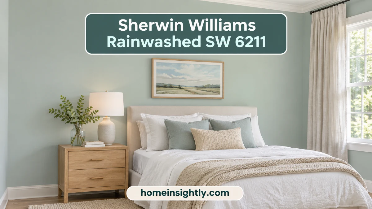
Sherwin Williams Rainwashed (SW 6211) is a light, airy blue-green-gray paint color with an LRV of 59. Sherwin-Williams files it under green, but on the wall it reads as a soft, coastal blue-green with gray undertones and cool tones that feel calm in bedrooms, bathrooms, and other quiet spaces.
If you are choosing a calming blue-green for a bedroom, bathroom, kitchen cabinets, or a front door, and you are torn between Rainwashed, Sea Salt, and Palladian Blue, this guide to Sherwin Williams Rainwashed is for you. It covers what color Rainwashed is, whether it leans blue or green, its undertones and LRV, and how lighting changes it. You will also find the best white trim colors, coordinating and complementary colors, side-by-side comparisons, room-by-room ideas, sampling tips, and short answers to the questions people ask most.
Quick answer: Sherwin Williams Rainwashed is a cool, light blue-green-gray (Hex #C2CDC5, RGB 194, 205, 197, LRV 59). It tends to look bluer in cool light, greener in warm light, and softer and grayer in dim rooms.
Rainwashed at a Glance
- Color: light, airy blue-green with gray undertones
- Code: SW 6211, Sherwin-Williams
- LRV: 59 (medium-light)
- Temperature: cool
- Hex and RGB: #C2CDC5 and 194, 205, 197
- Best rooms: bedrooms, bathrooms, nurseries, entryways, kitchen cabinets, laundry rooms
- Best white trim: Pure White (SW 7005) or Extra White (SW 7006)
- Closest similar colors: Sea Salt, Benjamin Moore Palladian Blue, Quietude
- Must do: sample it in your own light before you buy
Who Is Sherwin Williams Rainwashed For?
Rainwashed is a good fit if you:
- want a calm, spa-like blue-green that is not a bright pastel
- like coastal, farmhouse, or soft traditional decor
- have a bedroom, bathroom, nursery, or entryway that needs a gentle color
- prefer a color with a little gray so it does not feel too sweet or too loud
Rainwashed may not be right if you:
- want a color that looks warm in every light, because Rainwashed stays cool
- have lots of warm greige, taupe, or cream finishes that you cannot change
- want one color for the whole house, because it is a color, not a neutral
- need a very pale shade for a tiny, dark north-facing room (try Opaline instead)
What Color Is Sherwin Williams Rainwashed (SW 6211)?
Sherwin Williams Rainwashed is a pale blue-green with a soft gray base. It belongs to the blue-green color family, which Sherwin-Williams lists under green, and it brings to mind sea glass, morning mist, and a cloudy day at the coast. The gray in the formula keeps it from looking like a bright mint or a baby-blue pastel, so many people treat it as a colorful neutral.
Sherwin-Williams includes SW 6211 Rainwashed in the Recharge palette of its LivingWell Collection, a group of coastal colors described as calming, cool blue hues. It is listed for both interior and exterior use and shares that palette with Sea Salt, Opaline, Silvermist, and Comfort Gray.
| Detail | Rainwashed SW 6211 |
|---|---|
| Paint name | Rainwashed |
| Brand | Sherwin-Williams |
| Color code | SW 6211 |
| Color family | Green (a light blue-green with gray) |
| LRV (Light Reflectance Value) | 59 |
| Hex code | #C2CDC5 |
| RGB | 194, 205, 197 |
| Temperature | Cool |
| Undertones | Blue and green with gray |
| Collection | LivingWell Collection: Recharge |
| Use | Interior and exterior |
| Neighbors on the color strip | Window Pane (SW 6210) and Quietude (SW 6212) |
Because Rainwashed looks different on a screen than on a wall, treat the hex and RGB values as a reference only and judge the color with a real sample.
Handy Tip
Always search and order by the code SW 6211 together with the name. Matching by code avoids mix-ups with similar blue-greens and lets the paint store mix the exact formula. Free color chips and peel-and-stick samples are the fastest way to see it in your own room.
Other Important Rainwashed Color Questions
Here are quick answers to the questions that come up most often. Each topic is explained in more detail later in this guide.
Is Sherwin Williams Rainwashed blue or green? It is both. The color blends blue and green with a touch of gray, and which one you notice depends on your light.
What colors are in Rainwashed? Mostly blue and green, softened by gray. The gray gives it a slightly moody, rainy-day character.
Is Rainwashed warm or cool? Cool. Its two main colors, blue and green, are cool tones.
What is the LRV of Rainwashed? 59, which puts it in the medium-light range.
Is Rainwashed a neutral? Not quite. It has enough gray to feel understated, but it is still a color, so it works best in a few rooms rather than in every room of the house.
Can Rainwashed be used outside? Yes. Sherwin-Williams lists it for interior and exterior projects, and it suits coastal and cottage-style homes.
Is Sherwin Williams Rainwashed Blue or Green?
Sherwin-Williams classifies Rainwashed as a green, yet most people see a noticeable amount of blue in it. It is a true blue-green blend with gray, so the answer depends on the room and on how you perceive color. What shifts it:
- In rooms with warm southern light or warm bulbs, Rainwashed picks up more green.
- In cool north-facing light or under cool LED bulbs, it leans bluer.
- Beside white trim and cool decor it can look more blue. Beside wood and warm neutrals it can look greener.
- In dim rooms the gray in the formula comes forward and it looks like a dusty sea glass green.
In short, think of Rainwashed as a light blue-green-gray that never fully commits to one side. If you want a color that stays clearly blue or clearly green, compare it with Palladian Blue (bluer) or a muted green such as Dried Thyme (greener) before you decide.
Where Sources Disagree About Rainwashed
If you read several paint guides, you will notice that they do not always agree. Some call Rainwashed bluer than Sea Salt, and others say it leans greener. Numbers such as the LRV of deeper neighbors like Quietude also vary slightly from page to page. That is normal, because undertones are a matter of perception, and photos and screens change colors. The only fixed values are the official ones: the code SW 6211, the LRV of 59, Hex #C2CDC5, and RGB 194, 205, 197. For everything else, trust a large sample in your own room over any article, including this one.
What Are the Undertones of Sherwin Williams Rainwashed?
The rainwashed undertones are blue and green with a gray base. The gray undertones soften the color and keep it from looking bright or minty, which gives it a sophisticated, coastal feel.
- Blue: adds a cool, watery feeling and shows up more in morning light and north light.
- Green: adds freshness and shows up more in warm light and in south-facing rooms.
- Gray: adds depth, makes the color look muted, and becomes more visible in low light.
There is no yellow in Rainwashed, so it feels clean and airy rather than earthy. It also never turns truly warm. If you want a paint color that can look warm in some lighting and cool in others, a greige or a warmer sage may suit you better.
Is Sherwin Williams Rainwashed a Warm or Cool Color?
Rainwashed is a cool color. Its blue and green base reads cool, and the gray undertones keep it from looking icy. That is why it feels spa-like and fresh, and why it looks so natural in bathrooms, bedrooms, and coastal-style rooms.
Cool does not have to mean cold. Rainwashed has enough color to feel welcoming in north-facing rooms, where very cool paints can look flat. If your room already has many cool tones, such as chrome, white tile, and gray stone, Rainwashed will lean even cooler. Add warm wood, brass, or linen and the room feels balanced again.
What Is the LRV of Sherwin Williams Rainwashed?
The LRV of Rainwashed is 59. LRV stands for Light Reflectance Value. It is measured on a scale from 0 (pure black) to 100 (pure white) and shows how much light a color reflects. A higher number means a lighter color that bounces more light around the room.
At rainwashed LRV 59, the color sits in the medium-light range. It brightens a room without washing out, and it has more depth than very pale colors such as Opaline. That depth helps it hold its color in a very bright room, where a lighter color could fade, and it also looks pretty in a dim room, where some gray-blue-greens turn flat.
| Color | LRV | What it means next to Rainwashed |
|---|---|---|
| Pure White (SW 7005) | 84 | Bright white trim and ceilings |
| Rainwashed (SW 6211) | 59 | Medium-light blue-green-gray |
| Sea Salt (SW 6204) | 63 | Slightly lighter and grayer |
| Agreeable Gray (SW 7029) | 60 | Almost the same lightness in a warm greige |
| Quietude (SW 6212) | High 40s | Noticeably deeper |
LRV 59 also has a practical benefit. Colors in this range tend to hide small scuffs and fingerprints better than bright whites, which helps in kitchens, kids’ rooms, and hallways.
How Sherwin Williams Rainwashed Performs in a Real Space
A paint chip only tells part of the story. Here is how Rainwashed typically behaves once it is on the wall.
How It Looks in Different Lighting
Light is the biggest reason Rainwashed changes from room to room. The same wall can look blue in the morning, green in the afternoon, and gray at night. Natural light and artificial lighting both matter, so check the color in both.

| Room exposure | What to expect |
|---|---|
| North-facing | Cooler and bluer, calm and a little icy. Rainwashed has enough color to avoid looking flat. |
| South-facing | Warm light pulls out the green. The color looks brighter, softer, and coastal. |
| East-facing | Fresh blue-green in the morning, greener and softer in the afternoon. |
| West-facing | Muted in the morning, deeper and warmer green toward sunset. |
Time of day matters as well. Morning light is cool and makes Rainwashed look airy and blue-forward. As the day warms, it shifts greener. At night, when natural light fades, the blue drops back and a dusty gray-green tone remains.
Artificial lighting changes it too. Cool white or daylight bulbs keep it clean, aquatic, and blue-leaning. Warm bulbs bring out sage-like and sea glass green tones, and very dim lighting makes it look grayed down and subdued. Choose bulbs for the mood you want and test the color under them.
Is Rainwashed High-Maintenance?
No. Rainwashed is forgiving. The medium-light depth of an LRV 59 color helps hide minor scuffs, smudges, and fingerprints better than brighter whites or very pale tints, and the gray in the formula keeps it from showing every mark.
Clean washable finishes with mild soap, warm water, and a soft sponge. Avoid abrasive cleaners that can dull the sheen, and keep a small amount of leftover paint for touch-ups. Outdoors, rinse off pollen and mildew with a low-pressure hose.
Furniture and Decor Styles That Complement It
Rainwashed suits relaxed, nature-inspired styles. Natural wood, crisp white, and textured organic materials all work well with it.
- Coastal style: light oak or driftwood furniture, linen curtains, woven seagrass rugs, and brushed nickel or chrome hardware.
- Farmhouse style: medium oak or cherry tables, cream upholstery, jute rugs, cotton throws, and navy accents in baskets or art.
- Spa and modern style: white linens, subway tile, marble, matte black or pewter fixtures, and a simple wood vanity.
- Contemporary neutral style: warm greige furniture, taupe sofas, off-white trim, and light maple shelving.
A simple rule keeps it balanced: choose one neutral and no more than three stronger colors, then repeat those colors in different sizes around the room.
Finish and Texture: Choosing the Right Paint Finish and Sheen
The paint finish and sheen change how Rainwashed looks as much as the light does. Higher sheens reflect more light and can make the color look slightly lighter and more saturated. Flatter finishes look softer and deeper.
| Surface | Suggested sheen | Why |
|---|---|---|
| Bedroom and low-traffic walls | Flat, matte, or eggshell | Soft look that hides wall flaws |
| Living room and dining room walls | Eggshell | Velvety and easy to touch up |
| Bathroom walls | Eggshell or satin | Handles humidity and splashes |
| Kitchen walls | Satin | Easier to wipe clean |
| Cabinets, trim, and doors | Satin or semi-gloss | Durable and washable |
| Exterior siding and doors | Satin or semi-gloss exterior paint | Sheds dirt and cleans easily |
For texture, smooth surfaces and thin, even coats give the best result. A lightly textured finish such as limewash or plaster on an accent wall can add a coastal feel without overpowering this soft color.
What Is the Best White Trim Color With Sherwin Williams Rainwashed?
Rainwashed is flexible with white trim, but true, clean whites look sharpest. They contain little or no yellow, so they keep the blue-green looking fresh instead of muddy.
| White | Code | LRV | Notes |
|---|---|---|---|
| Sherwin-Williams Pure White | SW 7005 | 84 | Bright but soft. A reliable first choice. |
| Sherwin-Williams Extra White | SW 7006 | 86 | Crisp and slightly cooler for a modern look. |
| Sherwin-Williams High Reflective White | SW 7757 | 93 | The brightest option for strong contrast. |
| Benjamin Moore Chantilly Lace | OC-65 | 91 | Clean, bright white. |
| Benjamin Moore White Dove | OC-17 | 85 | Softer and warmer. It works but is not the first choice. |
Be careful with creamy off-whites that carry a lot of yellow. Some designers find that very warm whites look dingy next to Rainwashed’s clean, cool color. If your existing trim is warm white and repainting is not an option, sample the color against it before you commit. The result is often fine.
Colors That Go With Sherwin Williams Rainwashed
Rainwashed is a team player. It works with crisp whites, warm greiges, natural wood, and deep navy or charcoal accents. These are the main coordinating colors for Rainwashed, and the guide below shows how to use each one.
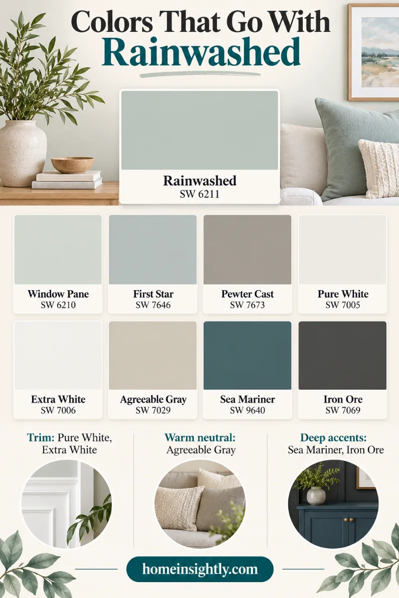
Coordinating Colors Listed by Sherwin-Williams
- Window Pane (SW 6210): a lighter, fresher blue-green for a tone-on-tone look.
- First Star (SW 7646): a clear, cool white with a hint of gray.
- Pewter Cast (SW 7673): a cool gray with purple undertones for grounding.
Complementary Colors for Rainwashed
Sherwin-Williams Agreeable Gray (SW 7029)
Agreeable Gray is a warm greige with an LRV of 60, almost the same lightness as Rainwashed. It adds warmth and balance on furniture, adjoining walls, and trim, and it flows well in open-concept spaces. Rainwashed is a cleaner color than most warm grays, so sample the two together first. A lighter greige such as Eider White also works well in adjoining rooms.
Sherwin-Williams Pure White (SW 7005)
A crisp, soft white with an LRV of 84. It works on ceilings, trim, doors, and cabinets, and it lifts Rainwashed without making the room feel stark.
Sherwin-Williams Extra White (SW 7006)
Brighter and slightly cooler than Pure White, with an LRV of 86. It suits modern or coastal rooms, millwork, and doors where you want a clean, gallery-like frame.
Sherwin-Williams Sea Mariner (SW 9640)
A deep navy-teal with gray and green hints. It adds dramatic depth against Rainwashed’s lighter, misty tone and works well on a front door, an accent wall, or upholstery.
Sherwin-Williams Iron Ore (SW 7069)
A deep, cool charcoal. A small amount on window frames, hardware, or an accent piece keeps a room full of Rainwashed from feeling too light and airy.
Warm accents help too. Soft coral, blush, terracotta, and honey wood tones bring out the blue-green and add warmth.
Rainwashed Color Palette Ideas
- Coastal calm: Rainwashed, Pure White (SW 7005), Sea Mariner (SW 9640), light oak, and woven textures.
- Soft farmhouse: Rainwashed, Agreeable Gray (SW 7029), cream upholstery, jute, and aged brass.
- Modern spa: Rainwashed, Extra White (SW 7006), Pewter Cast (SW 7673), marble, and matte black fixtures.
- Grounded contrast: Rainwashed, First Star (SW 7646), Iron Ore (SW 7069), and walnut wood.
Sherwin Williams Rainwashed Compared to Other Colors
This soft blue-green with gray undertones can almost play a neutral role, yet it has enough character to add interest. Looking at similar colors to Rainwashed side by side is the best way to see undertones. Here is how it compares.
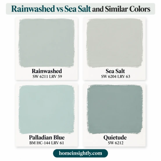
| Color | Code | LRV | Main difference |
|---|---|---|---|
| Rainwashed | SW 6211 | 59 | Reference color |
| Sea Salt | SW 6204 | 63 | Lighter, grayer, and softer |
| Palladian Blue (Benjamin Moore) | HC-144 | About 61 | Slightly more vibrant and airy |
| Quietude | SW 6212 | High 40s | Deeper and more dramatic |
| Silvermist | SW 7621 | Mid 40s | Darker and grayer |
| Opaline | SW 6189 | About 72 | Much lighter and less blue |
| Silverpointe | SW 7653 | About 64 | Lighter and closer to a neutral |
| Agreeable Gray | SW 7029 | 60 | Warm greige, different color family |
Quick Decision Guide: Which One Should You Choose?
| If you want… | Start with… |
|---|---|
| A little more color and a crisp, spa-like feel | Rainwashed (SW 6211) |
| A softer, grayer blue-green that behaves like a neutral | Sea Salt (SW 6204) |
| A slightly more vibrant, airy blue-green | Benjamin Moore Palladian Blue (HC-144) |
| A deeper, more dramatic blue-green for a feature wall or cabinets | Quietude (SW 6212) |
| Something much lighter for a small or dark room | Opaline (SW 6189) |
Sherwin Williams Rainwashed vs. Sea Salt
People often compare Rainwashed vs Sea Salt because both are pale blue-green-grays with a similar blue-to-green balance. Sea Salt (SW 6204) has an LRV of 63, so it is a little lighter. It also has more gray, which makes it softer and more neutral. Rainwashed carries a bit more color and feels crisper.
In practice, Rainwashed often looks bluer in cool light, while Sea Salt can look gray-green or even slightly beige in strong sun. If you want a color that behaves like a calm neutral, start with Sea Salt. If you want a little more color and character on the walls, start with Rainwashed. Sherwin-Williams places both in the Recharge palette of the LivingWell Collection.
Sherwin Williams Rainwashed vs. Benjamin Moore Palladian Blue
Palladian Blue (HC-144) is very close to Rainwashed in lightness, with an LRV of about 61. It has less gray and slightly more blue and green, so it looks a little more vibrant and airy and can look minty in some lighting. Rainwashed is more muted. Choose Palladian Blue for a historic sky-and-sea feel and Rainwashed for a calmer, grayer coastal tone.
Sherwin Williams Rainwashed vs. Quietude
Quietude (SW 6212) sits right beside Rainwashed on the color strip. It is deeper, with an LRV in the high 40s, and has more depth overall. That makes it more dramatic. Use Quietude for a feature wall, a north-facing room, or cabinets, and Rainwashed for a lighter all-room look. They also work together: Rainwashed on walls and Quietude on a door or built-ins.
Rainwashed vs. Sherwin-Williams Silvermist
Silvermist (SW 7621) is a darker, grayer blue-green with an LRV in the mid 40s. It feels earthier and moodier. It makes a good accent in north-facing rooms or beside wood trim. Choose Rainwashed for air and Silvermist for grounded elegance.
Rainwashed vs. Sherwin-Williams Opaline
Opaline is one of the lightest blue-green choices, with an LRV of about 72. It is much lighter than Rainwashed and not as blue. If Rainwashed looks too dark in a small or north-facing room, Opaline is a good color to sample.
Rainwashed vs. Sherwin-Williams Silverpointe
Silverpointe (SW 7653) has a strong gray undertone with only a hint of blue-green, so it behaves more like a neutral. With an LRV of about 64, it is lighter than Rainwashed. Pick it if you want the idea of a blue-green with less color.
Rainwashed vs. Agreeable Gray
Agreeable Gray (SW 7029) is a warm greige, so it is a very different color. Its LRV is 60, nearly the same as Rainwashed. It is a useful partner for furniture and adjoining spaces, but Rainwashed can look fussy beside warm grays and taupes, so test the pairing.
Other Color Options to Consider
- Benjamin Moore Bali: another soft blue-green worth sampling beside Rainwashed.
- Window Pane (SW 6210): a lighter blue-green from the same color strip.
- Comfort Gray (SW 6205): a softer, grayer option from the same Recharge palette.
- Oyster Bay (SW 6206): a deeper gray-green from the same Recharge palette.
- Sherwin Williams Stardew: a slate blue-gray worth comparing if you want a bluer look. See Stardew.
- Sherwin-Williams Drift of Mist: a soft light gray with the same airy feel. See Drift of Mist.
How Rainwashed Performs Across Different Areas
The room changes how Rainwashed looks. These sections are the main room-by-room guide. Choose the finish for each surface from the sheen table above.
| Room | Fit | Key point |
|---|---|---|
| Bathroom | Excellent | Looks paler under artificial light |
| Bedroom | Excellent | Can look icy in a north-facing room |
| Nursery and kids’ rooms | Very good | Soft and gender-neutral |
| Kitchen cabinets | Good | Hides fingerprints better than white |
| Living room | Very good | Use on one wall or zone in open plans |
| Laundry room | Very good | A low-risk first room to try |
| Dining room | Good | Cool contrast with wood |
| Entryway | Good | Needs warm lighting |
| Exterior and front door | Use with care | Intense sun can make it look lighter |
Rainwashed Bathroom
A rainwashed bathroom feels spa-like. Pair it with white subway tile, marble or quartz, a white vanity, and brushed nickel or chrome fixtures for a clean, timeless look. The medium-light depth helps small bathrooms feel bright without glare.

In a windowless bathroom lit by recessed and vanity lights, expect the color to look slightly paler and grayer. White trim, a soft white ceiling, and a few warm wood accents keep it from feeling cold.
Rainwashed Bedroom
A rainwashed bedroom is calm and restful. The color is easy to live with because it brightens the space without feeling bold. It looks fresh in morning light and soothing in the evening. Pair it with white linens, light oak or walnut nightstands, cream curtains, jute rugs, and navy pillows, and finish the trim and ceiling in a clean white.
Rainwashed Nursery and Kids Rooms
Rainwashed is soft enough for a nursery. It feels gentle and gender-neutral, and white trim with simple black-and-white art keeps the look fresh. Choose a washable finish for rooms that will see sticky hands.
Rainwashed Kitchen Cabinets
Rainwashed kitchen cabinets look fresh and relaxed. The muted tone and LRV 59 hide fingerprints and small splatters better than white. Use a durable cabinet enamel, and pair the color with white or gray-veined quartz, brass pulls, open oak shelves, and a white tile backsplash. If you want neutral walls, a warm greige such as Agreeable Gray balances the cool cabinets.
Rainwashed Living Room
In a rainwashed living room, the color keeps antique and traditional furniture feeling fresh, airy, and serene. It works well with white fireplaces, white ceilings, and wood tables. In open-concept spaces, use it on one main wall or in one clear zone so the color flows without overwhelming the whole floor plan.
Rainwashed Laundry Room
A laundry room is a smart place to try Rainwashed. It is a small, functional space where a clean coastal color feels cheerful. Paint the walls or the cabinets, and add white shelving and black hardware for a crisp look.
Rainwashed Dining Room
A rainwashed dining room gets cool contrast against wood and beige furniture, and it fits French country and coastal decor. Warm lighting over the table keeps the color inviting at dinner.
Rainwashed Entryway
An entryway painted Rainwashed gives guests a soft, welcoming first impression. Pair it with a white console, natural wood, and warm lighting so it never feels chilly.
Rainwashed Exterior
Sherwin-Williams lists Rainwashed for interior and exterior use. It is not the most popular exterior paint color, because many homeowners want more gray or depth on a house, but it can look charming on cottages, coastal homes, and Southern-style houses with bright white trim. The medium-light depth holds up better than very pale colors in strong sun, yet intense sun can still make it look lighter. Use exterior paint, and test a large sample on the house in both sun and shade.
Rainwashed Front Door
A rainwashed front door looks soft and welcoming. It reads greener in daylight and bluer in the shade. Pair it with white, light gray, or beige siding, brass or black hardware, and a navy or cream wreath.
Rainwashed in Real Homes: Room-by-Room Ideas
The room guides above explain how Rainwashed behaves in each space. The ideas below add specific scenarios and techniques instead of repeating them. They are example scenarios based on how the color is commonly used in real homes, not photos of specific houses. Whatever you choose, sample before you paint.
Laundry Rooms with Rainwashed
1. Vintage-Vibe Laundry Room
Rainwashed cabinets set against a black-and-white hex tile floor, marble counters, and black-framed windows give a laundry room a retro look without feeling busy. The patterned tile does the visual work, so the soft cabinet color acts as the calm middle layer. Keep the walls white or very light so the cabinets stay the star.
Exteriors with Rainwashed
2. Haint Blue-Green Porch Ceiling
In the American South, painting a porch ceiling a pale blue-green is a long-standing tradition, often called haint blue, and folklore says it keeps spirits away. Whatever you believe, it looks like soft sky overhead. Porch ceilings sit in shade, so Rainwashed leans bluer there. White beams, a white ceiling fan, and weathered wicker keep the look light. Check your sample in the shade where the ceiling actually sits.
3. Southern Charmer Exterior Paint Color
A two-tone house can look polished and relaxed. Rainwashed on the upper level with a greige lower level or base visually grounds the house, so the soft color floats above a warmer foundation color. Because Rainwashed is cool, the greige adds warmth near the ground, where brick, stone, and plantings bring their own warm tones.
Bathrooms Using Rainwashed
4. Paint for an Instant Bathroom Upgrade
On a tight budget, a paint-only refresh can modernize a dated bathroom. Keep the existing tile and vanity, clean and re-caulk where needed, and repaint the walls Rainwashed. Replacing outdated cabinet pulls and the mirror frame adds a finishing touch without a remodel.
5. Great for a Glam Bathroom Look
A large window floods the room with daylight, which brings out both the blue and the green in Rainwashed. Because the color is soft, a freestanding tub, a gold-framed mirror, and a crystal or glass light fixture can stand out as the glam details. Keep the wall color as the quiet backdrop and let the metallic pieces do the talking.
6. Rainwashed Trim, Walls, and Cabinets
Using one color everywhere can look intentional when you vary the sheen: a flatter finish on the walls and a satin finish on the trim and cabinets creates subtle contrast without a second color. It highlights architectural details such as paneling and crown molding. Keep counters bright and floors honey-toned so the room does not feel heavy.
7. Darling Interior Door Color
A Rainwashed interior door makes a charming accent, especially against deeper wall colors, where the pale blue-green stands out as a soft, fresh contrast. It works well on a bathroom, pantry, or closet door when you want a small pop of color without painting the whole room. Paint the frame too, for a cleaner look.
Bedrooms Using Rainwashed
8. What a Difference a Gallon of Paint Makes
A guest room with bold yellow or red walls can become a tranquil retreat with one color change. Strong colors can show through a pale topcoat, so use a tinted or stain-blocking primer first and plan on two coats of Rainwashed. Then swap busy bedding for white and natural textures to finish the calm.
9. Great Contrast with White Wainscoting
Paint Rainwashed above white wainscoting so the lower wall stays crisp white and the upper wall adds color. Repeat the wall color on a side table or bench, add a deeper blue-green throw or quilt, and use one bold accent, such as purple in a pillow or art, so the palette feels designed rather than matched.
10. Rainwashed Shiplap
Shiplap adds texture, so Rainwashed on a shiplap accent wall behind the bed gives a country-chic room a slight coastal feel. Brush the grooves first so paint reaches the seams, then roll the boards so they do not look patchy. Keep the other walls plainer so the texture stays the focus.
Dining Rooms Using Rainwashed
11. A Serene Sunroom Ceiling
In a sunroom with a slanted or vaulted ceiling, painting only the ceiling Rainwashed draws the eye upward and makes the space feel taller. Keep the walls and trim white so the ceiling reads as a soft sky, and expect the color to look lighter near the windows and slightly deeper in the shadier part of the ceiling.
Kitchens Using Rainwashed
12. French Country Kitchen Cabinet Color
In a French country kitchen, Rainwashed cabinets look pale and lovely beside a brick-textured backsplash. Painting the range hood the same color turns it into a feature, and the soft blue-green keeps the red-brown brick from feeling heavy. Add a farmhouse sink and plenty of daylight so the cabinets read fresh.
Living Spaces Using Rainwashed
13. Coastal Blue-Gray in Shadows
In an open coastal living room, one Rainwashed wall can look vibrant near the windows and shift toward blue-gray on the shaded side of the room. Cobalt vases and brown wood furniture balance the shift, and a white sofa keeps the room bright. It is a good reminder to check the color in the dimmest corner before you commit.
14. Looks Right in a Reading Room
A small reading nook is a low-risk place to commit. Rainwashed walls with a white ceiling and trim, a cream chair and ottoman, and a simple white desk create quiet dimension while the color still looks pale and soft in the nook’s gentle light.
15. Beautiful with Navy Blue
Pair Rainwashed walls with a navy velvet sofa and all-white wall art. The deep navy and the pale blue-green seem to contrast, yet they share cool tones, so they feel complementary. Keep art frames and pillows white so the navy stays the only dark note.
How to Decide If Sherwin Williams Rainwashed Is Right for You
Choosing a color like Rainwashed is easier than choosing a neutral, but a few checks will help you get it right the first time.
Evaluate Your Light
Do not rely only on photos. Photos are color-corrected and edited, and you cannot tell how bright the room in the picture is. Judge a large sample in your own light.
- In a north-facing room with little natural light, Rainwashed can look too dark or icy. Try Opaline or Silverpointe instead.
- In a south-facing room with a lot of sun, Rainwashed can wash out. Try Palladian Blue for more color.
- In rooms with mixed light, test the color at several times of day.
Pay Attention to Your Decor
Blue-green is easy to decorate with because people love both blue and green. You can play up both colors or just one. Choose one neutral and no more than three stronger colors, and repeat each stronger color at least three times in different sizes.
Test It Out the Way the Pros Do
Paint a large sample on white poster board, or use a peel-and-stick sample, and move it around the room. Do not paint small squares directly on the old wall color, because it will influence what you see. Compare Rainwashed with other colors in the same family so you can spot undertones.
Tips for Sampling Sherwin Williams Rainwashed
Rainwashed changes with the light, so paint sampling and swatch testing are essential. Here is a simple sampling plan.
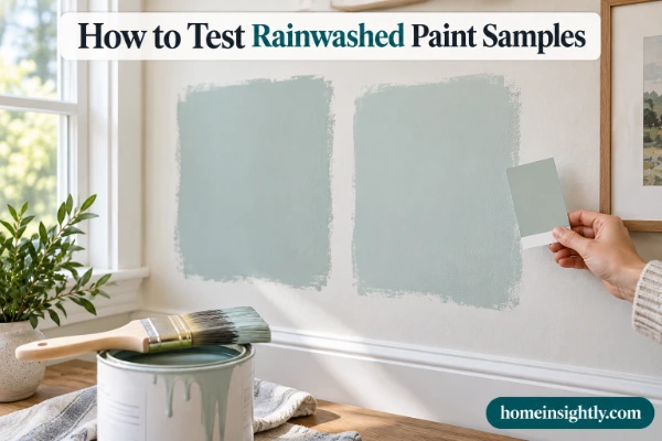
- Use a large peel-and-stick paint sample, such as a Samplize sample, or paint a white poster board and leave a white border of two to four inches.
- Move the sample around the room and look at it in the morning, afternoon, and evening.
- Hold it next to your floors, cabinets, and upholstery to see how the undertones shift.
- Check it under your real bulbs, both warm and cool, at night.
- Sample at the sheen you plan to use.
- Compare it with Sea Salt, Palladian Blue, Quietude, and Opaline.
- Use the ColorSnap Visualizer to preview the color on a photo of your room, then confirm with a real sample.
Sherwin-Williams also offers free color chips, peel-and-stick samples, and sample-size paint, so you can try SW 6211 in your home before you buy a full can.
Final Thoughts
Sherwin Williams Rainwashed is a soft, light blue-green-gray that brings calm and a natural, coastal feel to bedrooms, bathrooms, nurseries, entryways, kitchens, and even exteriors. With an LRV of 59, cool tones, and gray undertones, it is easy to live with and forgiving. It looks best with clean white trim, warm wood, and a few deeper accents like Sea Mariner or Iron Ore.
It is a color, not a neutral, so it works best when you commit to it in a few rooms and sample it carefully in your own light.
Your Pre-Paint Checklist
- Confirm the code SW 6211 and the LRV of 59.
- Decide the room, the sheen, and the trim white (Pure White or Extra White are the safest).
- Sample Rainwashed next to Sea Salt or Palladian Blue.
- Check the sample in morning, afternoon, and evening light and under your bulbs.
- Choose your accents: warm wood, Agreeable Gray, or a deep Sea Mariner or Iron Ore.
Do Not Skip This Step!
The fastest way to pick a color that misses the mark is to skip the sample step. Test Rainwashed in your home, in your light, next to your finishes, before you paint.
How This Guide Was Prepared
This guide is based on Sherwin-Williams’ official listing for SW 6211 and its LivingWell Collection Recharge palette, cross-checked against five leading Rainwashed guides. Where sources disagree, the text says so and uses rounded values. The guide describes how the color typically behaves and does not claim personal painting tests. Colors look different on every screen and in every room, so always confirm with a real sample.
FAQs About Sherwin Williams Rainwashed
Is Sherwin Williams Rainwashed blue or green?
Both. Sherwin-Williams files Rainwashed under green, but it blends blue and green with gray. It looks bluer in cool light and greener in warm light.
What colors go well with Rainwashed?
Sherwin Williams Rainwashed pairs well with Pure White (SW 7005), Extra White (SW 7006), Agreeable Gray (SW 7029), Window Pane, First Star, Pewter Cast, Sea Mariner (SW 9640), Iron Ore (SW 7069), and natural wood.
What is the difference between Sherwin Williams Rainwashed and Sea Salt?
Sea Salt (LRV 63) is lighter and grayer, so it feels softer and more neutral. Rainwashed (LRV 59) has more color and often looks bluer in cool light.
What is Joanna Gaines’ favorite Sherwin Williams paint color?
There is no official single favorite. Design coverage most often links her with Alabaster (SW 7008) for trim and walls, plus soft neutrals such as Agreeable Gray and the gray-green Silver Strand.
What color compliments SW Sea Salt?
Crisp whites like Pure White, warm neutrals such as Agreeable Gray or Accessible Beige, natural wood, and navy or charcoal accents complement Sea Salt.
What is the most popular Sherwin Williams blue?
For deep blues, Naval (SW 6244) is widely cited as the most popular. For soft, light blue-greens, Sea Salt (SW 6204) and Rainwashed (SW 6211) are among the favorites.
What colors are similar to Sherwin Williams Rainwashed?
Sea Salt, Benjamin Moore Palladian Blue, Quietude, Silvermist, Opaline, Silverpointe, and Benjamin Moore Bali are the closest colors to sample beside it.
What color makes a house look expensive?
Designers often point to cohesive, restrained palettes: soft warm whites or neutrals, one consistent trim color, and a deeper accent like charcoal, navy, or deep green. Quality finishes and good lighting matter as much as the color.
Does Sherwin Williams Sea Salt look gray?
It can. Sea Salt has a gray undertone, so in low light or strong sun it may look gray-green or slightly beige. In balanced light it reads as a soft green-blue-gray.
What is the most popular shade of green Sherwin Williams?
Popularity varies, but Sea Salt, Evergreen Fog, and Pewter Green are the greens most often named. Sea Salt leads for light blue-green, and Evergreen Fog and Pewter Green for deeper gray-greens.